
David Jones
For interviews with other painters see: Ellyn Bivin / Josiah Golson / James Mckissic / Renel Plouffe / James Tucker / Larry Young
“Upon winning first prize in 1960 at the Normal Park Elementary School Art Show as a first grader, David Jones pretty much disappeared from the art scene. In 2008, after a 25-year career in banking, finance and accounting, he returned to art.”
Thus begins David Jones’s artist’s biography, his tongue-in-cheek opening concealing his considerable passion for modern artistic expression. Indeed, modernity is at the heart of his aesthetic. He lives in a townhouse notable for its contemporary architecture, its view of the city of Chattanooga, and its light filled three story interior. He and his wife, Laura, have seamlessly blended their collection of modern art with Laura’s collection of Mexican folk art.
David’s studio is on the third floor and is a functional space free of anything not directly needed for his work, though he is quick to admit that more often than not he can be found doing art in the odd moment he can spare at Graffiti: a Hill City art joint. David and Laura founded the gallery in 2012 to showcase contemporary abstract and non-representational art by Chattanooga artists. Graffiti is located in a small house at 629 Spears Avenue, in the Hill City neighborhood off N. Market St. in North Chattanooga. The gallery features the art of both resident artists, whose work is in every show, and guest artists, who are invited to show their work for one month. With few exceptions Graffiti does a reception on the first Friday of every month. “It’s a pretty grueling schedule for most of us,” David says, “but we’re a small gallery and it’s very important to keep things fresh. We turn over 65-75% of the art for each show so people who attend the receptions are certain to have new art to look at month after month.”
When David began creating art after years of collecting it he discovered that he didn’t like using a brush, feeling that it kept him at a psychological distance from the creative process. After experimenting with different media, he found that oil pastel suited him best and he developed his technique around that medium. Always a non-representational artist, his earlier work was geometric in nature, built from a composition of related shapes, tones, and colors. After first drawing a complex, asymmetrical grouping of these shapes, he laid out areas of color, which he blotted and streaked with paper towels. After repeatedly smearing and blending colors, sharpening the shapes, and adding additional color, he would eventually arrive at an image that contained both rhythm and structure.

Untitled XXI
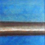
As his work developed he began to evolve this approach, simplifying his images to a degree. Complex arrangements of differing geometric shapes gave way to to the placement of his ring motif on a background of bands of color. Where the rings had shared importance with other shapes they now assumed the dominant role.
By 2012 David’s work was being well received and was starting to sell, but he was running up against the limitations of the method he had worked out. “I was working on illustration board using oil pastel and then rubbing it out with paper towels. The illustration board took the oil pastel really well and its surface was tough enough to handle the rubbing up to a point, but there were limits. Once illustration board is pushed beyond those limits the surface gives way and the painting is ruined. It can happen really fast.”

Untitled LII
David also found himself artistically restless. Several years before, he had seen a color field painting by Mark Rothko at the Art Institute of Chicago. “For years I had only seen his work in the little one inch by two inch reproductions in art books and I wondered what the big deal was. I thought Rothko’s work was a bit of a fraud; imagine museums hanging these blocks of color and thinking they should be taken seriously. Then I saw the real thing in its true scale. The colors and the glazing grabbed my eye and I was transfixed. I just stared and stared at his work. It seemed like a whole psychic universe was there hanging on the wall.” Thinking about Rothko’s paintings, David began to wonder if the multiplicity of shapes in his work were really necessary. “I liked the idea of juxtaposing the shapes with each other and with the field behind them, but I felt like the approach I was using had run its course. I just didn’t need that level of complexity anymore.”
Enter Scott Upton. David and Laura were in Asheville visiting galleries when they came upon Scott’s work at the Blue Spiral Gallery. They were both strongly drawn to his paintings, but assured each other they couldn’t afford to buy one of his works. However, on a later trip to Atlanta, they saw Upton’s work at the Thomas Deans Gallery, and this time they didn’t hesitate, purchasing one of his paintings for their collection. Though delighted with the new painting, for David there was something more:Upton’s use of a very simple shape embedded in a complex and layered background suggested a way forward.
A Gallery of work by David Jones
-
- David Jones– Stillpoint #1
-

- David Jones– Homage to Scott No. 2 24×48
-

- David Jones– The Warmth of Silence 48×48
-

- David Jones– Untitled LVIII 48×48
-

- David Jones–Untitled LXII 48×24
-

- David Jones– Red, Purple & White 48×48
As David began to seek a depth of color and space in his work that he had not tried before, it soon became apparent that his old way of doing things was not going to work. One overriding concern was the fact that the surface of illustration board was just too delicate to handle the level of working and reworking that was necessary to build the layers of color. The solution to this problem came from close at hand. One of David’s goals in starting Graffiti was to present the work of street artists—graffiti artists—in a way that would allow it to be removed from its location and sold. Working with his business partner, Jim Wilson, the two men figured out an efficient way to mount Hardie board, the cement board laid down before tile is put down on a floor, to the sides of the building where it proved an excellent (and movable) surface for graffiti artists to work on. The Hardie board might be heavy, thought David, but it’s almost indestructible. He decided to give it a try.
Again there was a learning curve. Hardie board is nearly indestructible but its surface is also considerably rougher and more porous than that of illustration board. It simply ate up oil pastel, and his early efforts showed David how difficult it was to get the sharp edges and definition easily obtainable on his old support. Having continued his ‘ring’ painting approach in the early trials, he accepted that he would have to leave that behind too. “I was seeking a way to make images that had layering and depth, that really drew the viewer into the work. I was willing to do whatever I had to do to make that happen.”
Today the rings are gone, replaced by one simple rectangle. David’s work on a recent picture, ‘Blue Steel’, is a good example of his current method. Beginning with a 48”x48” sheet of Hardie board, he first laid down bands of color in oil pastel, after indicating the location of a small rectangle. The location of the rectangle and how it scaled with the image size was important. Once that had been determined, he placed bands of light blues and grays over the naturally warm yellowish color of the Hardie board. For the rectangle he chose tan. Once the pigment had been applied, he rubbed down the image with paper towels dipped in Gamsol, an odorless paint thinner. The odor of the turpentine he used in his early experiments made him queasy and he found that Gamsol, though more expensive, was definitely preferable. Rubbing down with Gamsol not only blurred the pastel, but locked it in place as it dried. Once the light blue layer was finished, he worked over the surface with dark blue and again rubbed down with Gamsol. The image was now ready for him to lightly sand the surface, revealing bits of the lighter blue and warmer color beneath the dark blue. The result gave the surface a layered ‘glazed’ quality.
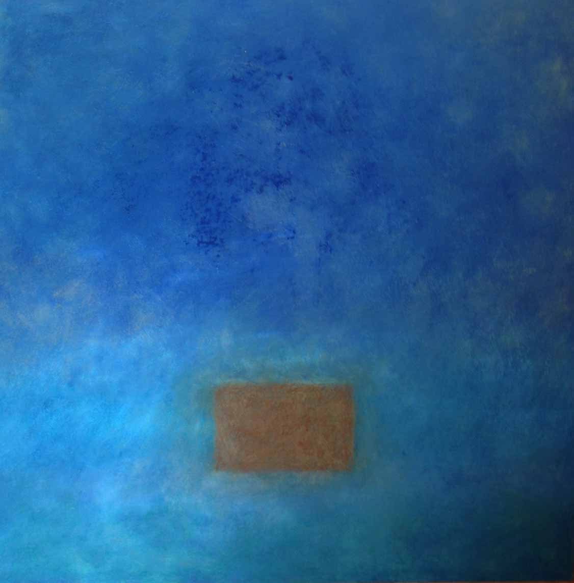
Blue Steel– preliminary stage
“At this point I felt like I was on the right track,” David said, “but the background hadn’t been pushed far enough and the color of the rectangle was wrong. I thought that the tan would have a nice ‘pop’ to it against the cool blue and gray, but instead it just looked awkward and misplaced.”
With that in mind, he changed the rectangle to a gray more in keeping with the image’s cool tonality. Then he reworked the field around the rectangle to achieve more depth and complexity.
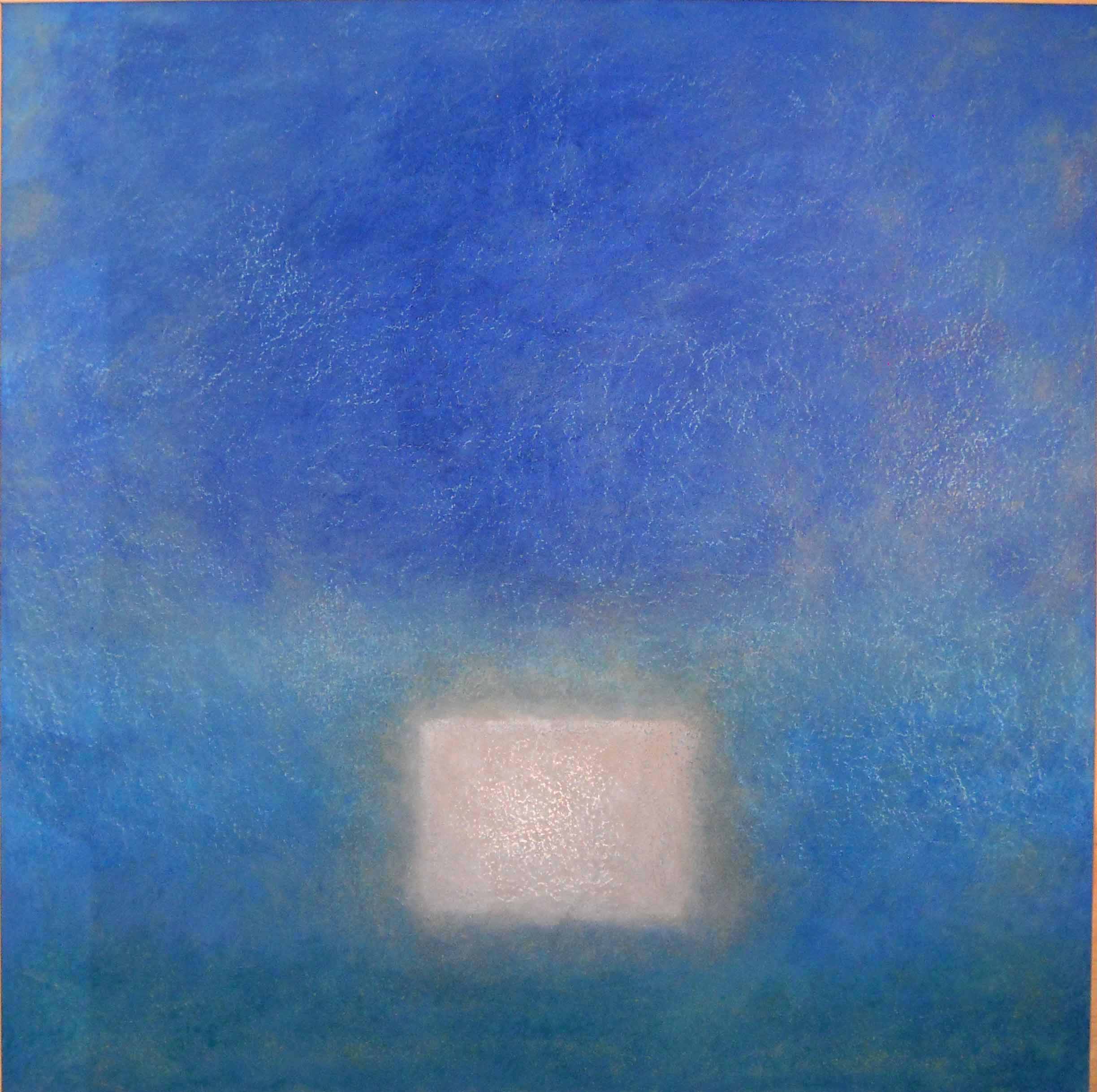
Blue Steel–Final
As for the future? David says he is happy with his current art but already he is thinking of new directions. Recently he found a pile of old construction plans in a roadside trash bin. “A great find!” he says, “I’d been looking for schematic drawings of some sort to use in my work. I have no idea what I’m going to do yet, but there should be some really interesting things that can be done with them.” And no doubt he will find them.
Yet for now Graffiti, a Hill City Art Joint, is consuming most of his energies. “Graffiti is not about my art. It’s about the work of a talented group of artists and a type of art that Chattanooga sees too little of. When Laura and I started Graffiti, we weren’t sure of the reception abstract and nonrepresentational art would get. I think we’ve shown that there is a market in Chattanooga for the art we love and we’re now looking for a new location for Graffiti that will give this art greater exposure. It’s exciting for me each time one of our artists sells a work.”
Return to Interviews with Artists