I like making pen & ink drawings. I fell in love with pen & ink a long time ago and can’t see giving it up any time soon. You can find the story of my early days working in pen & ink elsewhere on this website in, Things Like That Just Happen in a College Town.
What follows in this essay is a description of how I went about making the ink drawing “The Wayfarer II”. To those who are not artists it may offer a chance to see what goes on prior to the presentation of the finished artwork on a gallery wall, rather like attending rehearsals for a play. However, please don’t think mine is the only way, or even the best way, to go about the development process. It is my way and that’s all I can offer. I took photos periodically as I worked on the drawing, and those, along with an explanation of what is going on, should give some idea of how I proceed from idea to finished artwork.
To start, here are a few other examples of my work in this medium:
Gallery I of recent ink drawings
-
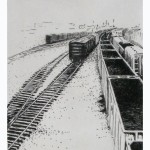
- Trainyard 7×4.5 Pen & ink on Bristol Board
-

- Morgana 5.75×6.75 Pen & ink
-
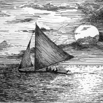
- Night Sailing 8×10 Pen & Ink on Bristol Board
-

- Entre Nous 10×8 Pen and Ink wash on d’Arches HP
As an artist I tend to think in terms of tonality and have never been bothered by the lack of color in monochromatic artwork. Of course ink drawings need hardly be monochromatic. If color is what drives your world, inks are now made in a dizzying array of hues, but as for me, black ink against white paper is good enough to realize my goals for many subjects. Pen & ink is a simple medium, a challenging medium, and one that encourages a thoughtful approach to its limited means. When you add the subtle grays possible with ink wash drawing, the creative possibilities are near limitless.
As for me, black ink against white paper is good enough…
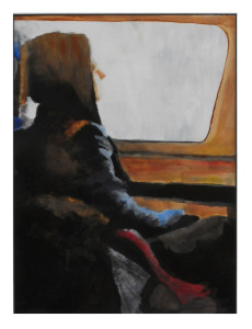
“The Wayfarer 1” 9×7 Acrylic on D’arches CP– Private Collection
The pen & ink drawing I’ll be discussing has its origins as part of a series meant to evoke the loneliness of the traveler. I’ve traveled a good deal over the years, and it can be an emotionally solitary experience. People move about, boarding planes and trains, lost in their own private worlds, dwelling in a space apart. While in Montreal with my wife, Deb, we hiked (really it’s just a walk) to the top of Mont Royale where we found a large visitor pavilion. The October day was somewhat brisk, and we each got a cup of hot chocolate to take outside and drink while we enjoyed the view. As I waited on Deb to get her cup, I looked around the large building, likely constructed 70 or 80 years ago, and noticed small groups of people gathered at tables here and there, overwhelmed by the vast space. Struck by how much the place reminded me of an old train station, I snapped some quick photos before we went off to sit on the terrace with our warm drinks watching our fellow tourists puff their way up the pathway.
Reference photos for drawing

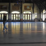

When we got home, I eventually went through the photos taken at the pavilion and selected a few to work with. None of them was well composed (my wife is the photographer in the family), but they all evoked for me a sense of the lonely, emptiness of a large train station.
Though the majority of the pieces planned for the “Wayfarer” series were to be smallish paper-based paintings, it just felt right to do this one in pen & ink. I can’t tell you why. Sometimes a subject just seems to call out for a certain treatment, and once you get that into your head, you just can’t see it any other way. I also made a decision early on to make the drawing relatively large, influenced, perhaps, by the space that inspired it.
Using elements from the photos, I made some quick compositional sketches. From these, I then worked up a preliminary drawing, something I don’t always do. There is often a great deal of charm in work done quickly without a lot of preplanning. However, this drawing would be too delicate in its tonal and compositional relationships to be approached that way. Work like this needs to be carefully thought out. Besides, my studio is a long way from Montreal, and I only have a few quickie photos to work from.
For other comments on the shaping of raw visual material into art, see: Frank Wilson’s Pasture
Here is my preliminary drawing.
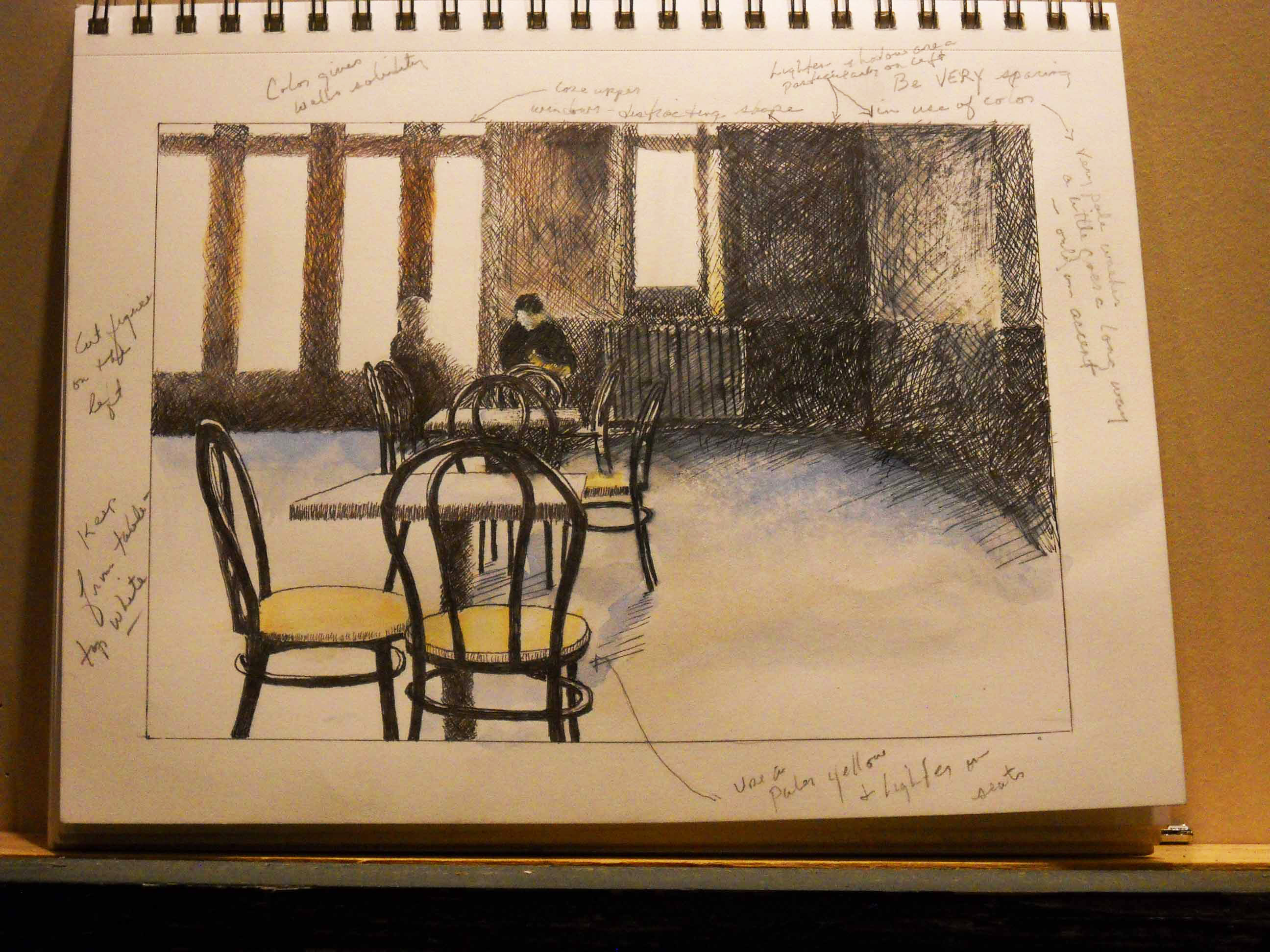
Study for “Wayfarer II”
Looking at this photo made from my sketchbook, you’ll notice lots of notes in the margins and even on the drawing itself. After I complete an acceptable preliminary drawing, I prop it up where I can see it and work on something else for a while. It takes time to see things objectively. Each day, as I move around the studio, the number of marginal notes grows as I notice little problems, consider alterations, or come up with improvements. Notes are better than changes to the drawing because they allow me to remember what I wanted to change without getting the preliminary all muddied up with corrections. And these notes are important, because I’ll be working from this preliminary realization of the subject as I do the final drawing.
The need for the fairly detailed study arises from other considerations as well. Since I’ll be using stark blacks in the foreground, the drawing needs to be satisfying. I don’t want the viewer’s eye to stop at one of the chairs and wonder if the drawing is correct or to get bogged down in a cluttered mass of lines. Further, there must be a good rhythm in the placement of the chairs so the viewer’s eye moves smoothly to the figure in the back (the star of our show). These are important issues, and the final drawing is not the place to figure any of them out. Granted, many of these considerations were dealt with in the compositional sketches that began the process, but they have now been realized in a semi-finished state that allows for a more thorough evaluation.
… the key to working with photos is to not work directly from photos.
I think the key to working with photos is to not work directly from photos. Art can be broadly defined as the communication of ideas or feelings by visual means. The problem with the camera is that the visual information it gives you still needs to be shaped and molded to the artist’s intent. When a photo achieves that state, it’s then art. That is why photographers are artists—they are capable of shaping the image both during the shoot and during editing, be that in the dark room or on a computer. But most photos (especially mine!) are just dumping grounds for visual information and must be used as the jumping off place to begin a piece of artwork. Preliminary drawings are where that editing process occurs for me. Elements need to be moved, or need to be cut, or need to be enhanced; in short, the visual material from the photo must be made to express my intentions. This mound of visual “facts” must be shaped to my goals. That’s why for me, poor quality photos are best to work from, because they force me away from imitation.

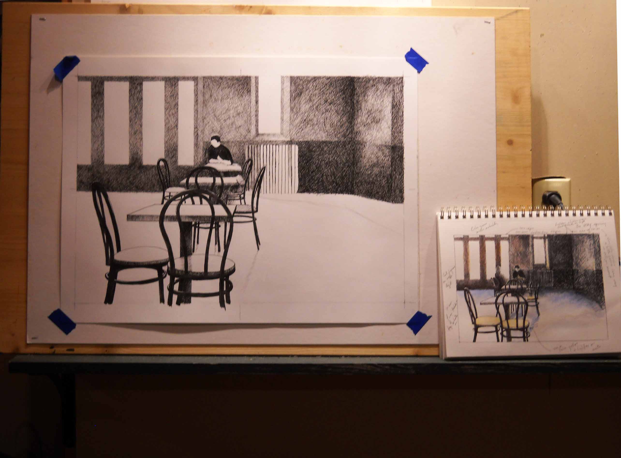
Beginning the final drawing
Above is the beginning of the piece. Since they are hard to see in the photo above, I’ll point out some of the differences between the preliminary drawing and the one in progress. In my early thinking, I had two groups of figures located at two different tables. However, by the time I made the preliminary drawing, I had reduced reduced this number to two people sitting at one table. Now I cut the less important figure out (note to new artists: improving composition almost always means cutting things out). Only the solitary traveler is left. The perspective has been subtly altered to further emphasize the empty chairs and the viewer’s distance from the figure. At this stage, the background is rather lighter than it is in the study and even lighter than it will be when I get finished, but I know that the chairs will be full strength black and I’ll have to balance the background with them, since I can’t do it the other way around. Lightening a large inked area is not practical, so I left enough tonal “wiggle room” to adjust it later. This approach also works with my intention to make the background shadows lighter and more nuanced in the final drawing.

The foreground chairs are added
And now the foreground chairs are added. The tonal axis of the drawing will lie between the black of these chairs and the seated figure. My goal is to have the viewer’s eye thrust into the scene, and I’m using several means toward this end. The tonal axis shoots straight back to the traveler, the main chairs line up toward him, and the white of the windows and the grays of the wall frame him. That sense of thrust is something the preliminary study needed enhancing. In order to better judge if that effect is coming off, I’ve propped a frame on the drawing to give me a better sense of the pictorial space.
Adding the figure
The last key element in the composition, the seated traveler, is put in. This is the moment of truth. If the drawing works at this point I’ll finish it. Composition is the skeleton of any drawing or painting; it’s the foundation on which everything else rests. There are many things in an artwork that can be “fudged”, but if the composition, the elemental basis of the piece, is flawed, there’s not much help for it. Though much still needs to be done to this drawing, if it isn’t working at this point, I’ll rip it up and pour myself a whiskey. Maybe two. Tomorrow is another day.
However, I’m not unhappy with the drawing at this point, though there is still much work to be done. The shadows along the floor at the back wall have to be brought forward and softened. The old radiator behind the figure requires definition, and there are many small touches needed in the tables. There is also the matter of deepening the shadows on the back wall in order to bring that large area into a better tonal balance with the chairs. Nevertheless, barring a really stupid decision on my part (and like all artists, I’ve had my share of those) the final drawing should be close to my intentions when I began it.

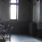
Final stage of “The Wayfarer II”
As in the preliminary drawing, I floated on a couple of watercolor washes, tinting the image to convey a sense of the cool autumnal light filtering through the large windows. Further, these washes set up one more juxtaposition—a warm/cool contrast of the red brown and the blue. The blue in this photo reads a bit stronger than is the case in the original but you should get a reasonable idea of the finished product.
So there it is. We’ve gone from hot chocolate in Montreal to a drawing made in Tennessee. And because I so like work done with pen & ink and in ink wash, I leave the reader with a gallery presenting a few more examples of the possibilities for this medium.
Copyright 2015 James Tucker
-

- “Frank Wilson’s Pasture” 9×24 Pen & Ink of Bristol Board
-
- “Arabesque II” 8×6 Ink wash
-

- “Feed Mill—Laurel, MS” 8×10 Pen & Ink on Bristol Board
-
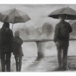
- “Rainy Day Monologues” 8×10 Ink Wash
-

- Early Morning Mist– Fishing 6×8 Ink wash on Waterford CP –Private Collection
-
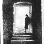
- Waiting 5×7 Pen & Ink on D’arches HP Private Collection