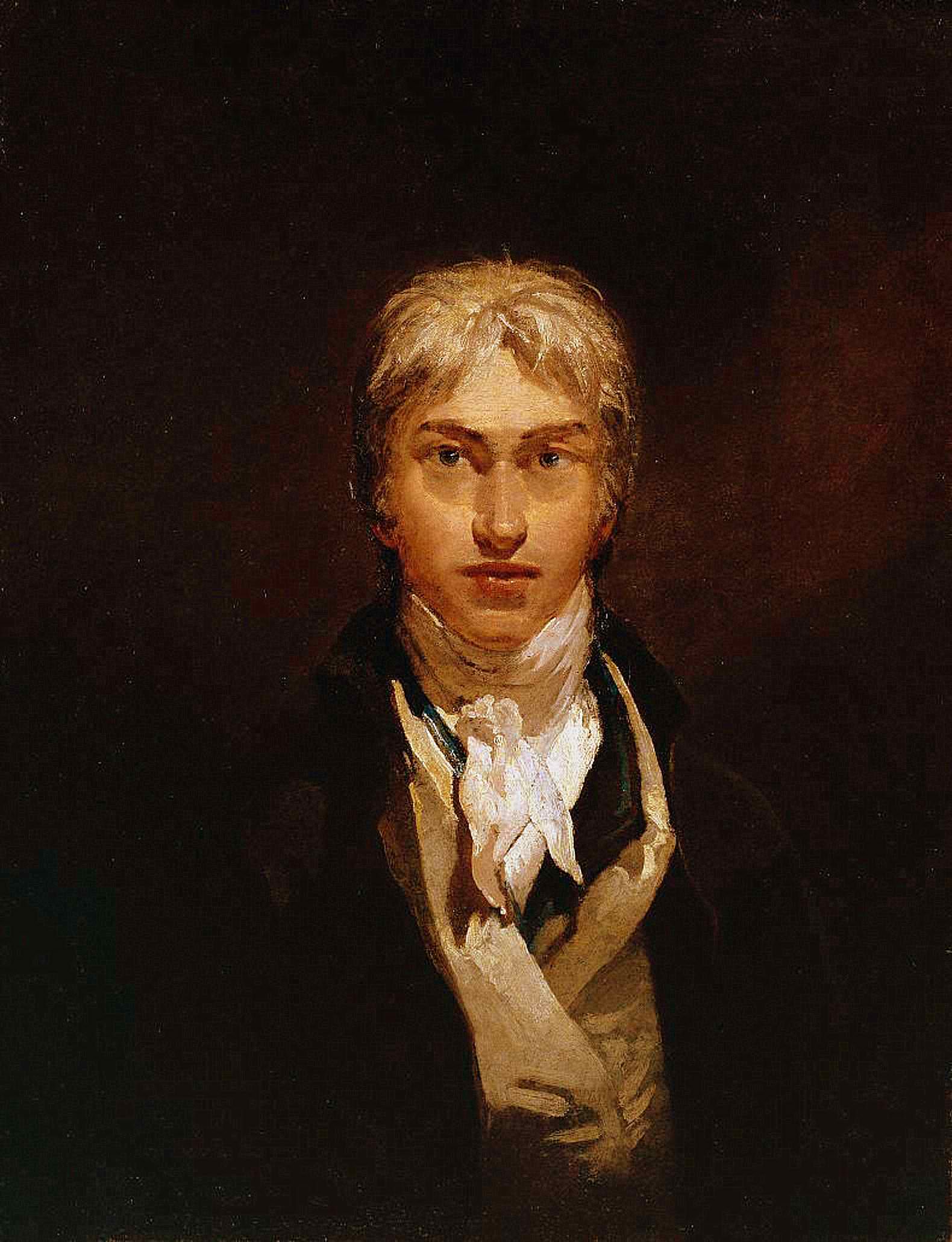
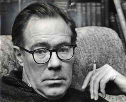
Diebenkorn –Portrait by Rose Mandel 1956
My wife and I are standing in San Francisco’s de Young Museum about to enter an art exhibit. The man looking out at us from the short film we are watching is Richard Diebenkorn. I want you to think of Salvadore Dali, his extravagance, the wild mustache, the publicity seeking; now think of Dali’s exact opposite. That man is Richard Diebenkorn. He is tall, lanky, well-spoken in a quiet voice, a voice that is somewhat shy. He is in his studio dressed in a button down shirt and corduroy slacks. He is wary of the fixed gaze of the camera. His voice often pauses as he carefully chooses his words. There is sometimes a hint of a shy smile. He is a quiet man. A man who does not desire the public eye, a man of regular habits who seeks his adventure with each painting he makes. And there is one other thing to mention. Despite the lack of showmanship or self aggrandizement he is one of the premier American painters of the second half of the twentieth century. A painter whose works evoke the light and spaces of California. He is an artist who remained true to his vision regardless of where it took him.
Beside us, printed on the wall, is the following note found among his papers after his death:
Notes to myself on beginning a painting
1. Attempt what is not certain. Certainty may or may not come later. It may then be a valuable delusion.
2. The pretty, initial position which falls short of completeness is not to be valued — except as a stimulus for further moves.
3. Do search. But in order to find other than what is searched for.
4. Use and respond to the initial fresh qualities but consider them absolutely expendable.
5. Don’t “discover” a subject — of any kind.
6. Somehow don’t be bored — but if you must, use it in action. Use its destructive potential.
7. Mistakes can’t be erased but they move you from your present position.
8. Keep thinking about Pollyanna.
9. Tolerate chaos.
10. Be careful only in a perverse way.
Sad to say, it is almost an accident that we are there at all and I cringe to think we might have missed such a wonderful presentation of this artists early work.
Our visit to the de Young was something of a consolation prize. We’d planned on visiting The San Francisco Museum of Modern Art, but found it was closed for renovation. Okay, we thought, the de Young has an excellent collection of American Art, so why not have a look at some of the iconic paintings from American art history. It was a vague plan but it was a plan. There was, of course, that Diebenkorn exhibit going on, we’d read about that, but it covered his time in Berkeley and ended before the great Ocean Park paintings he made in Santa Monica. I was inclined to take a pass. Deb was inclined to see it. We bought tickets and went in.
Richard Diebenkorn was artistically restless and was always very much his own man. He’d briefly tried New York in the 1940’s where he was heavily influenced by the Abstract Expressionists, but he soon fled west. “If you’re there,” he said, “you get all involved in the moment, in the issues that are always present but don’t really mean all that much. I like having had to rely on my own resources, although it seemed pretty desolate occasionally.”
Beginning as a committed Abstract Expressionist, the evolution of Diebenkorn’s work during the Berkeley years unfolds as one passes through the exhibition.
-
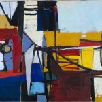
- Untitled (Sausalito #3) 1948
-

- Untitled 1950
-

- Untitled (Albuquerque) 1952
-
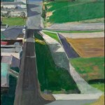
- Berkeley #3 1953
-

- Berkeley #57 1955
-
- Berkeley # 44 1955
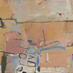
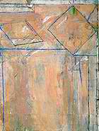
I find a representational element in the paintings of the 1950’s after the pure abstraction of the late 1940’s, as if the essence of the world around him is now being distilled for the canvas. “All paintings,” Diebenkorn said, “start out of a mood, out of a relationship with things or people, out of a complete visual impression.” The California light is there, the browns of the California landscape, and the pastel blues of the sky. In a similar way, I find an abstract element in even his much more representational work of the late 1950’s and early 1960’s.
-
- Cityscape I 1963
-
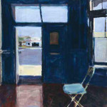
- Interior with Doorway 1962
-
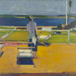
- Figure on a Porch 1959
Some critics thought Diebenkorn’s work was erratic, some called him a ‘traitor’ to Abstract Expressionism, and some simply dismissed him as no longer of being of interest. Diebenkorn had a much calmer view of the matter. “Abstract,” he said, “literally means to draw from or separate. In this sense every artist is abstract… a realistic or non-objective approach makes no difference. The result is what counts.” Timothy Burgard, the curator of the de Young, believes that Diebenkorn’s paintings always hovered between abstraction and depiction, a quality he called ‘oscillation’ and that he believes can be seen throughout the work in the exhibition. Diebenkorn has said that he turned his back on abstract painting because it became too easy for him. He needed the constraints that representation placed on him as something to struggle against.
After seeing the paintings for myself, I prefer to take Diebenkorn’s view of his evolution. “I was never throwing things away when I switched from one way of painting to another. You can see a continuum from representation to abstraction, although I must say it never felt like a smooth transition while I was in the middle of it.”
It is at this point in Diebenkorn’s career, 1966, that the exhibition at the de Young ends. In addition to the many paintings there are figure drawings. Diebenkorn worked from the live model for virtually his whole career, though he mainly saw it as a form of training. There are also various serigraphs and prints. It is wonderful work. For most artists it would have made a grand career. When Deb came out of the exhibition she was so moved by what she had seen she simply went off to take some time for reflection.
“I was never throwing things away when I switched from one way of painting to another. You can see a continuum from representation to abstraction, although I must say it never felt like a smooth transition while I was in the middle of it.”
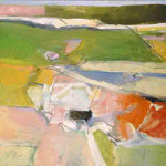
Though I meant to write only about this particular experience at the de Young Museum, I find it impossible to neglect what came next for this artist. The exhibition may end with the year 1966, but Diebenkorn’s work most certainly did not. In that year he and his wife, Phyllis, moved from San Francisco so he could take up a teaching position at UCLA. For the next twenty-five years he returned to nonrepresentational art, painting hundreds of abstractions, many of which comprise the sublime geometry of the “Ocean Park” series, so named because he maintained a studio for many years in the Ocean Park section of Santa Monica. After the years away from pure abstract painting his return is that of an artist of consummate mastery. A comparison of “Sausalito #3” painted in all its frantic energy in 1948 with the equally abstract “Ocean Park #129” and its suppressed energy beneath an outward calm speaks volumes about the distance traveled by this great painter.
-

- Ocean Park # 54 1972
-
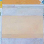
- Ocean Park #122 1980
-
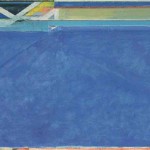
- Ocean Park #129 1984
And finally, in the very last years of his life,
Untitled #7 1991
The New York Times wrote upon his death in 1993, “From the beginning of his career, in the late 1940’s, he won admirers and exhibited widely. But the distance, both physical and psychological, that he maintained from New York tended to put him out of step with art-world fashion, and it caused either consternation or indifference in many critics. When Abstract Expressionism was ascendant in New York in the 1950’s, Mr. Diebenkorn switched from abstraction to figuration. When Pop Art made figuration fashionable in the 1960’s, he switched back to abstraction.”
Well, that’s true as far as it goes. But I see a different story playing out. I see a restless quest by a quiet man for a purity of expression that few us even know exists. The Ocean Park paintings are the magnificent culmination of this quest begun so many years before. Perhaps it is best to give Mr. Diebenkorn himself the last words:
“If what a person makes is completely and profoundly right according to his lights then this work contains the whole man. A work which falls short of this content, is only of passing value and lends itself to arbitrariness and fragmentation.”
For an audio interview with Richard Diebenkorn, visit: Diebenkorn Interview
It is a long interview and it gets off to a slow (boring) start but becomes very interesting as Diebenkorn explains his life and work in his own words. He was a precise and articulate man who was quite self aware. It’s worth the listening.
Other quotes from Richard Diebenkorn on the artistic process:
I don’t go into the studio with the idea of ‘saying’ something. What I do is face the blank canvas and put a few arbitrary marks on it that start me on some sort of dialogue.
I came to mistrust my desire to explode the picture and supercharge it in some way… what is more important is a feeling of strength in reserve – tension beneath calm.
When I am halfway there with a painting, it can occasionally be thrilling… But it happens very rarely; usually it’s agony… I go to great pains to mask the agony. But the struggle is there. It’s the invisible enemy.
Return to Artists and Their Art
Copyright 2013 James Tucker