Born in St. Louis, Missouri, Maria Willison moved to Bristol, Tennessee when she was six years old, upon her father’s taking a position at King University. Her interest in art began in high school, where she pursued painting and drawing, though she didn’t learn much about technique in her classes. “It was all about expressing yourself, without much mention of how to do it,” she says. After graduation she enrolled in Covenant College, graduating with a BA. Currently she works as a studio assistant to Cessna Decosimo and has taught at the Townsend Atelier. She has had work in several shows, most recently at the 2014 Four Bridges Festival in Chattanooga, where she received a grant as an emerging artist. In October 2014, her sculpture was featured in a joint show at The Northshore Gallery of Contemporary Art, “Figuratively Speaking”, which also included the paintings of James Tucker.
See more of Maria’s art at: Maria Willison
For interviews with other sculptors see: Bryan Rasmussen / Turry Lindstrom
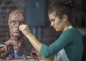
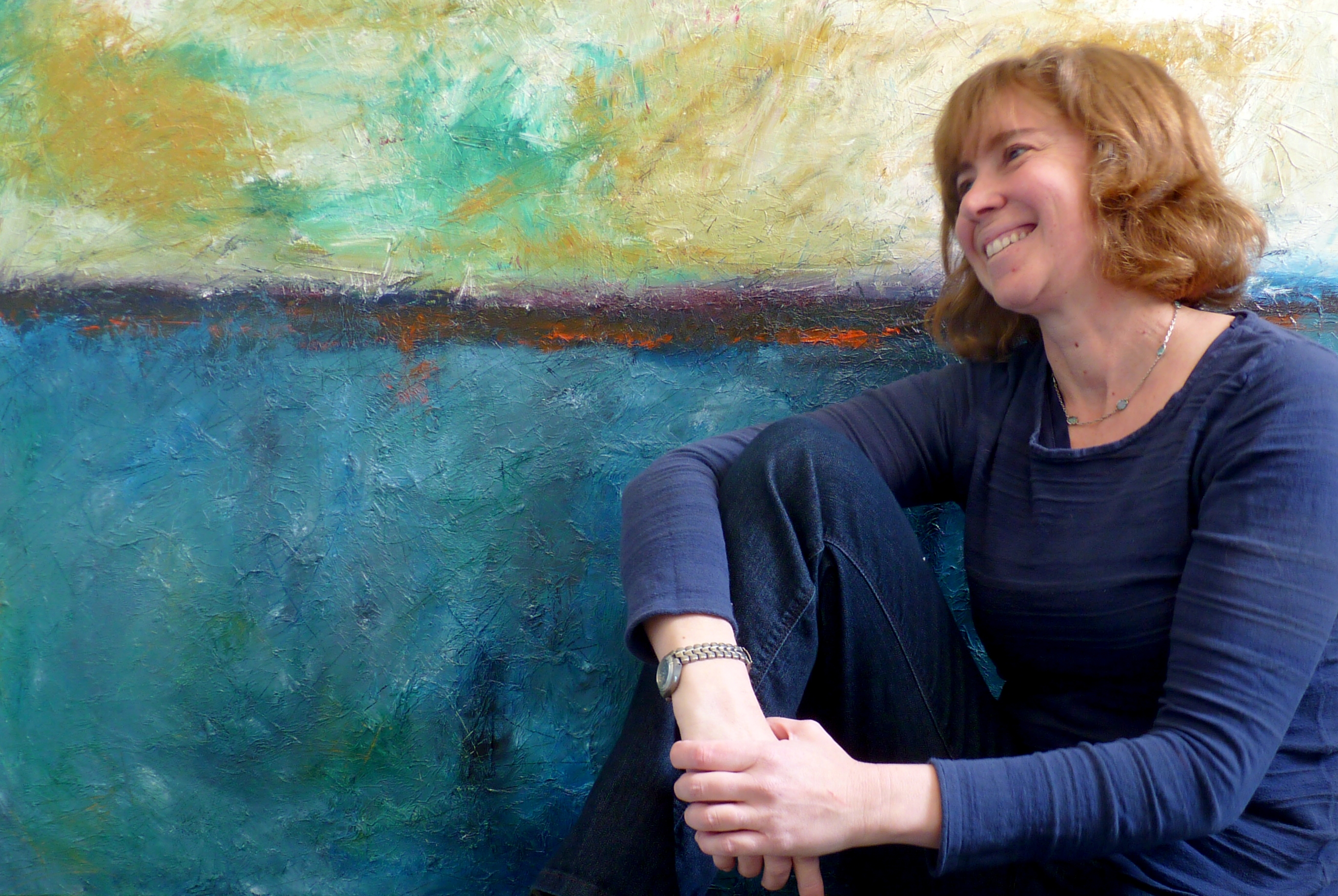
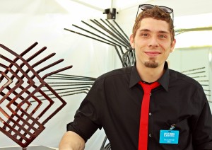
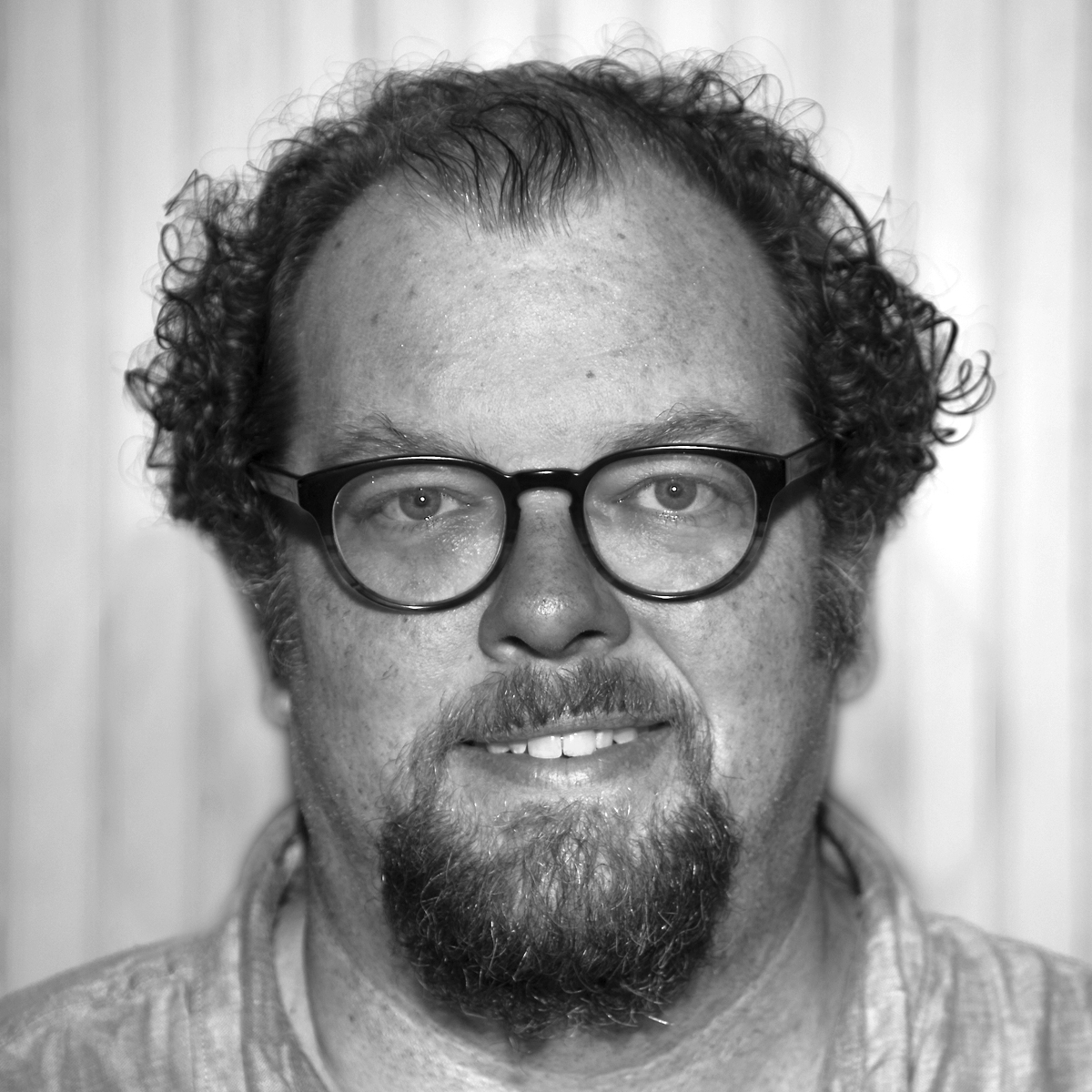
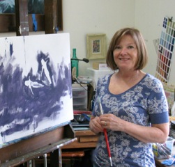
Maria Willison (photo: Samuel Burns)
So how did you find your way to sculpture?
I took a sculpture class during my sophomore year at Covenant College and thought: this is exactly how my brain works! This is exactly how I can express myself! Sculpture became my passion.
Did you have an art professor who was exceptional and who triggered this reaction or was it the medium and its possibilities that so excited you?
Both. The messier I am the more fun I have, and with clay you’re basically working with mud (laughs). My teacher was Kayb Carpenter– her married name is now Joseph–and she was trained in classical sculpting techniques in Florence, Italy. She has a deep knowledge of anatomy and figurative sculpture. I just fell in love with that approach and put a lot of effort into anatomical studies. She was very inspiring and really pushed me a lot. At the beginning of her classes we would often have quizzes on anatomy—the muscles of the arm, the back and so on. We also built a sculpture muscle by muscle. In addition to that, I took an anatomy class in the Biology Department to add to my knowledge base.

Esther
Why does the human form attract you so much?
Throughout history it has been a subject that really draws people in. You can work directly with human emotions, and people understand that because, after all, we’re all human. I love that. There is also the complexity and the challenge of it. The human body is a really hard thing to sculpt well, and I’ve set myself the goal of mastering it. I mean, really, if you can sculpt the human form you should be able to do anything else. The human form is exciting because it is so complex, but also it can be posed in meaningful ways that allow me to work with complex negative spaces around the figure. Often I don’t see all the implications right away, but I’ll come back to a piece after a while and it will just hit me: ‘ Wow, that side form was really what I was looking for!’
In an artistic statement you wrote, you said that negative space, dramatic line, and the dichotomy between peace and tension were what you thought about when making a sculpture. Can you elaborate on that?
Well, I’ve already talked about negative space, but that integrates with the line of the form. Negative space is defined by the empty spaces around the sculpture, whereas the dramatic lines lead the eye through the sculpture. The human figure, with its limbs and lines of muscle movement, gives you the chance to really point the viewer’s eye where you want it. It’s a cool way to work with the viewer and draw the viewer into the work. By establishing the pose, I can both define the figure and move the viewer mentally through the work.
My piece, ‘Grace and Disgrace’, is an example of what I mean by the peace and tension dynamic. The rising figure is almost the very essence of tension. It’s a pose that is almost painful to look at and would be impossible to hold, and yet, if you look at the face, there is a sense of peace and joy. If you look at the other pose, which is that of a person crouched and hiding herself, it’s physically peaceful, but it has psychological tension. It is the face of anguish and sorrow. A further dynamic comes in play because the two figures have to work together, pushing and pulling each other.

Grace and Disgrace
Do you have a preference for working with the male or female figure?
I do more female figures, I suppose because I connect with a female’s emotions more. From a conceptual point of view, I tend to think more in terms of the female figure, but I really enjoy working with the male figure, too. I like working with both. I usually choose male or female figures based on which one best helps me get my ideas across. In really simplistic terms, I suppose you could say that the male presents a more powerful muscular form and the female a more graceful, poetic one. Frankly, though, sometimes it’s just who is available as a model!
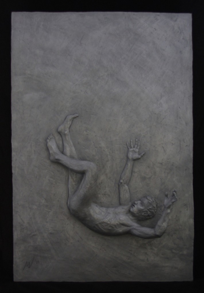
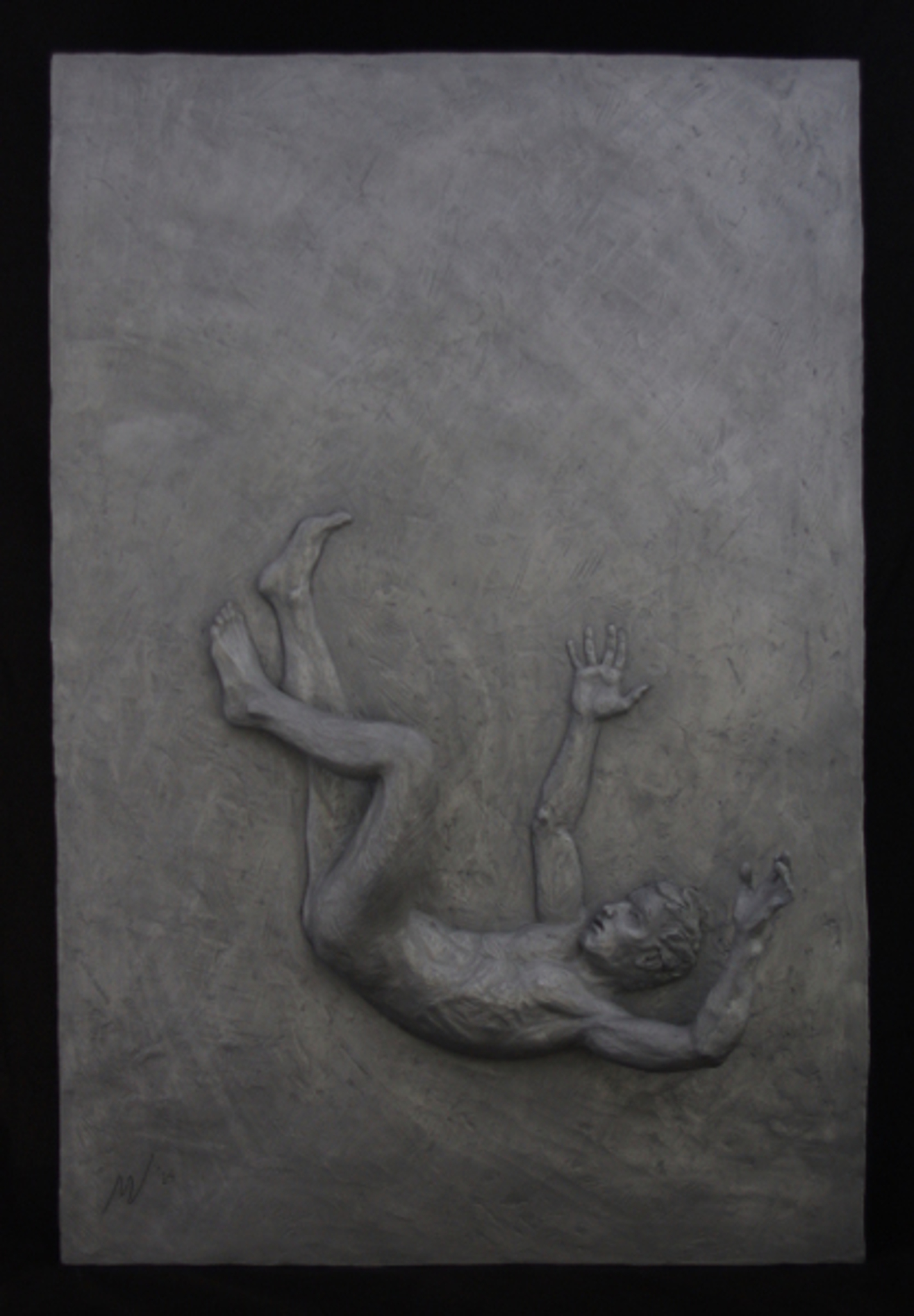
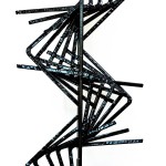
Vertigo
Why realism? We live in a world that is obsessed with being modern. It’s almost a fetish in some quarters to be continually on the ‘cutting edge’. Do you worry about your style being perceived as passé?
I just see the world that way. I find great beauty in the way in which the world, and particularly the human body, actually appear. I take great joy in rending it as it actually is. I enjoy helping people see what’s already in front of them, what’s already there. And I love the challenge of taking and working with what’s already there, but shaping it and molding it to make it my own.
That brings up an interesting idea. To what extent is your work not realistic?
Art is about personal expression, so I do emphasize certain things, but the distortion is subtle. Usually I try to pick a model whose appearance is close to what I want aesthetically. If I have an extreme pose, one that a person can’t hold long without hurting themselves, I might push the pose beyond where the model actually is, based on my knowledge of anatomy. Since I’m working in a realist idiom, the figure has to ‘read’ as correct, and that is, of course, my goal, but often there are small exaggerations made to better express what is inherent in the pose.
When you have an extreme pose like the ‘Grace’ figure in ‘Grace and Disgrace’, do you take photographs to shorten the posing time for the model?
I do take photos for reference, but a method I often use in that situation is to have the model do partial poses that she can maintain. For instance, in the ‘Grace’ figure I had the model sit in a chair and bend backwards as I worked the top half of the of the figure.Then I had her kneel and bend backward in a less extreme way that I exaggerated in my work, so her body was consistent with the more extreme bend when sitting. The hard part is making sure you have the rhythm of the overall flow of the body when working from partial views. That’s tricky, but it’s essential. It’s all in handling the transitions correctly, and I’ve gotten better and better at doing that.
Where do your ideas for new sculpture come from?
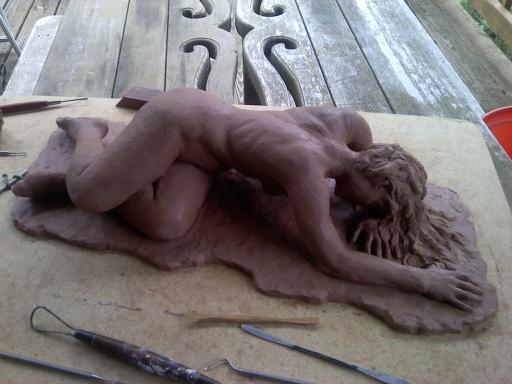
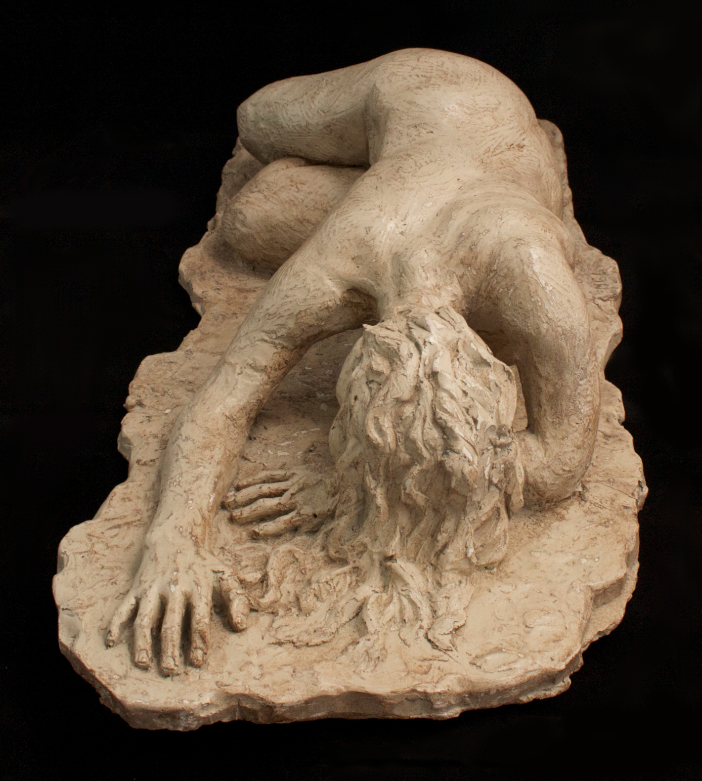
Usually they come from my own life experiences or those of the people around me. I think there’s a lot of anguish in my work, though people may not see it. In ‘Enervare’—that comes from a root word that means ‘enervate’ or drained of energy—the concept is about someone who has done something wrong and has done it over and over, becoming completely drained of energy, wondering, ‘why can’t I stop?’. When I have an idea, I try to figure out what it would look like visually. In this case, what it would look like if you were utterly exhausted.

Enevare– in progress

Evevare– finished piece
You’re saying that you begin with an idea and then work out a physical expression of that idea?
Sometimes, but not always. There are two basic ways I approach making a sculpture and that’s one of them. Sometimes I work in the opposite way. I wonder if it wouldn’t be cool to have the model pose in such and such a way, you know, an intriguing and visually interesting pose, and then I work to give that pose additional levels of meaning. I may begin with beauty for beauty’s sake, but I rarely end there. The knack for brainstorming a concept is a work in progress for me. That wasn’t the focus of my training, so it’s something I’m learning to do now.
After you’ve got the beginning point of a sculpture, how do you turn this idea into an actual artwork? What are your methods as you proceed from that point?
I’ve started doing some preliminary drawings. I used to not do those, but I’ve started finding them useful. I draw four or so different angles to think through the pose. Then sometimes I do a maquette, which is like a small three dimensional sketch, just to be sure my thinking is solid enough to carry through. Then I build the armature, which is the wire framework that gives strength to the clay. One of the things that I love about sculpture is that there are parts of the process that are very mechanical, and since I’m a very mechanically-minded person, I find that stuff fun. Once that’s done, I move on to getting the pelvis and the ribcage situated correctly. That’s got to be right. It’s not unusual for me to work on that aspect even before I engage a model. Once I’m satisfied with that, it’s just a question of building the work on out: first the figure is roughed in and then it’s defined and the transitions are smoothed out.


I’ve read that you work with both clay and plasticene.
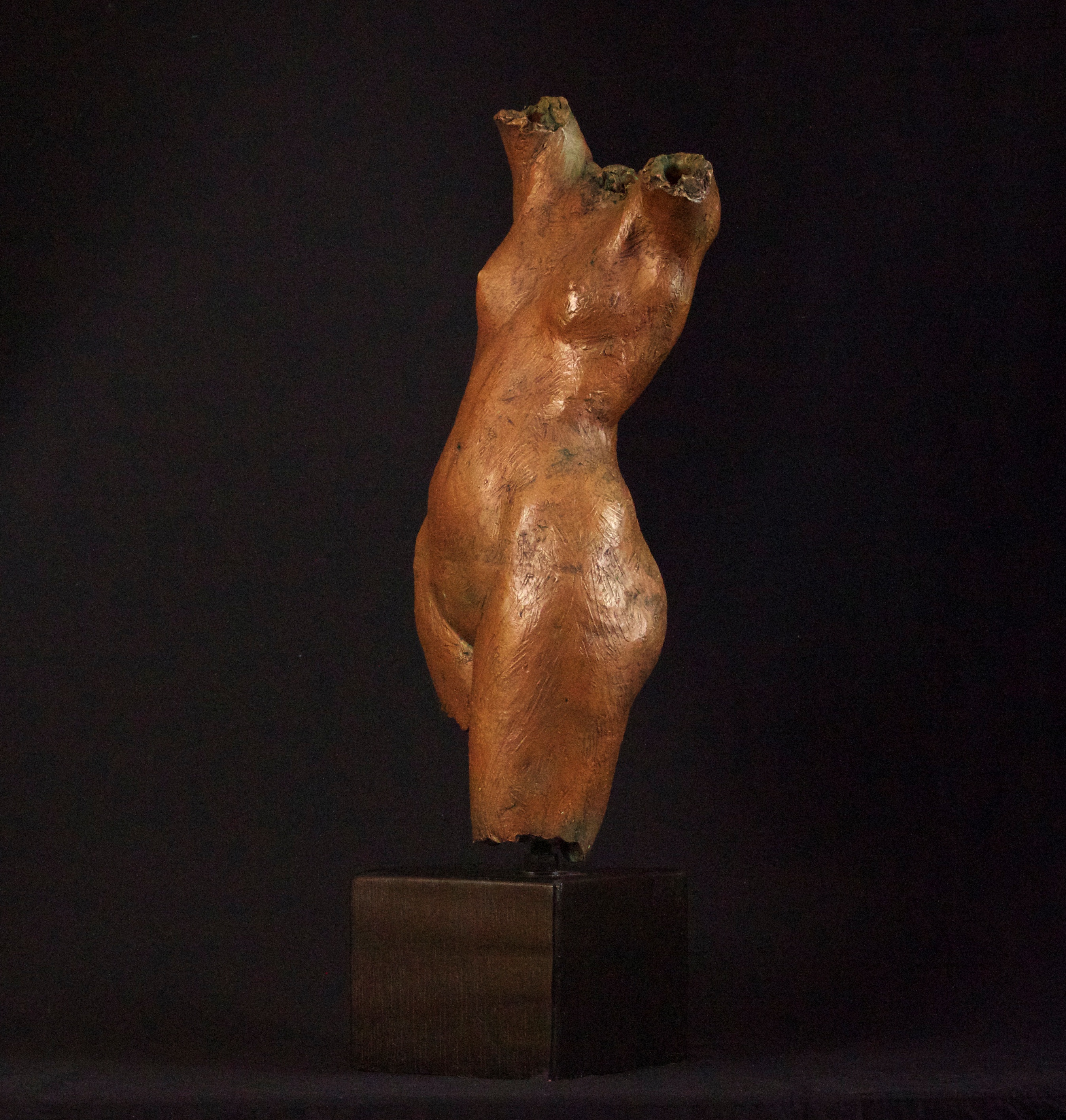
Yes, I use both, and they are rather different. With traditional water based clay, you have a limited time to work on a piece. Though there are ways to keep your work from drying out, the drying can’t be delayed forever. You either have to fire the piece or make a mold from it while it’s still wet. And of course, once a piece is fired you can’t change it. Plasticene, which is oil based, never dries out. When the sculpture I’m working on is ready, I make a mold and then take a casting from the mold. At that point the casting becomes the finished piece and the plasticene image can go back in the tub to be used over and over. The torso I had in the last show at The Northshore Gallery of Contemporary Art was made that way.
Do you have a preference for clay or plasticene?
I really don’t. I tend to work in one until I get tired of it and then I switch. Water clay allows me to go really fast. I like the speed and immediacy, and it really shows the process because it’s so sensitive to the touch. You can get that appearance with plasticene, but it usually means working on the surface with tools. It’s easier to get that look with water clay. Also, plasticene is harder to control with just your fingers and often my hands get really tired when I’ve working with it. However, with plasticene there is no time constraint, which encourages a push/pull, add and subtract exploration process that isn’t hurried. You can leave a piece for a long time and then come back to it

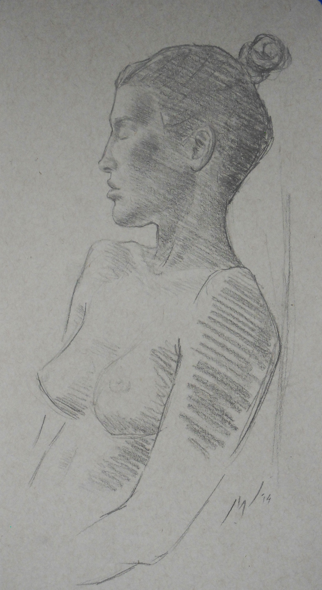
Graphite Female Torso

Female Torso
How did you do the finish on that torso? The surface had delightful quality about it.
I use a wax finish. I brush it on and it hardens pretty quickly. Then I polish it until it gets a nice sheen to it. I love that wax and use it all the time. That particular finish shows the marks made in the process of making the piece, which I think gives the work a warmer more immediate feel.
You use a variety of finishes: gray and bronze, among others. Are those your color signatures for a given sculpture? Are they meant as an immediate draw for the viewer’s eye?
I suppose so, though the best patina emphasizes the form and doesn’t call attention to itself. The ideal is to have the patina catch viewer’s eye, drawing him to experience the form and the dynamic tensions in the piece.
What artists have influenced your work?
Rodin, of course. His poses are really amazing! He’s very exciting to look at. And Bernini. The detail of his work is fantastic. I’ve only seen photos of his work, but in September I’m going with my husband to Florence, Italy, and I’ll finally get a chance to see the real thing. The movement in his Apollo and Daphne is amazing. He gives you visual motion and an incredible level of detail, but keeps it all subordinated to the needs of the piece.
You’re at an early stage of your career; where do you think your art is headed?
That’s a good question. I can see it becoming more abstract in time. Historically, that seems to be how it goes with many sculptors. I can see me breaking down the human form and manipulating it more obviously. My way of working is getting increasingly internalized, and my muscle memory has really developed to the point I’m often working without having to think everything through. As the process gets more automatic, it can get more creative.
Return to Interviews with Artists