Author Archives: Jim


Diebenkorn

Diebenkorn –Portrait by Rose Mandel 1956
My wife and I are standing in San Francisco’s de Young Museum about to enter an art exhibit. The man looking out at us from the short film we are watching is Richard Diebenkorn. I want you to think of Salvadore Dali, his extravagance, the wild mustache, the publicity seeking; now think of Dali’s exact opposite. That man is Richard Diebenkorn. He is tall, lanky, well-spoken in a quiet voice, a voice that is somewhat shy. He is in his studio dressed in a button down shirt and corduroy slacks. He is wary of the fixed gaze of the camera. His voice often pauses as he carefully chooses his words. There is sometimes a hint of a shy smile. He is a quiet man. A man who does not desire the public eye, a man of regular habits who seeks his adventure with each painting he makes. And there is one other thing to mention. Despite the lack of showmanship or self aggrandizement he is one of the premier American painters of the second half of the twentieth century. A painter whose works evoke the light and spaces of California. He is an artist who remained true to his vision regardless of where it took him.
Beside us, printed on the wall, is the following note found among his papers after his death:
Notes to myself on beginning a painting
1. Attempt what is not certain. Certainty may or may not come later. It may then be a valuable delusion.
2. The pretty, initial position which falls short of completeness is not to be valued — except as a stimulus for further moves.
3. Do search. But in order to find other than what is searched for.
4. Use and respond to the initial fresh qualities but consider them absolutely expendable.
5. Don’t “discover” a subject — of any kind.
6. Somehow don’t be bored — but if you must, use it in action. Use its destructive potential.
7. Mistakes can’t be erased but they move you from your present position.
8. Keep thinking about Pollyanna.
9. Tolerate chaos.
10. Be careful only in a perverse way.
Sad to say, it is almost an accident that we are there at all and I cringe to think we might have missed such a wonderful presentation of this artists early work.
Our visit to the de Young was something of a consolation prize. We’d planned on visiting The San Francisco Museum of Modern Art, but found it was closed for renovation. Okay, we thought, the de Young has an excellent collection of American Art, so why not have a look at some of the iconic paintings from American art history. It was a vague plan but it was a plan. There was, of course, that Diebenkorn exhibit going on, we’d read about that, but it covered his time in Berkeley and ended before the great Ocean Park paintings he made in Santa Monica. I was inclined to take a pass. Deb was inclined to see it. We bought tickets and went in.
Richard Diebenkorn was artistically restless and was always very much his own man. He’d briefly tried New York in the 1940’s where he was heavily influenced by the Abstract Expressionists, but he soon fled west. “If you’re there,” he said, “you get all involved in the moment, in the issues that are always present but don’t really mean all that much. I like having had to rely on my own resources, although it seemed pretty desolate occasionally.”
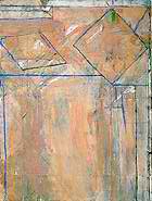
Beginning as a committed Abstract Expressionist, the evolution of Diebenkorn’s work during the Berkeley years unfolds as one passes through the exhibition.
-
- Untitled (Sausalito #3) 1948
-
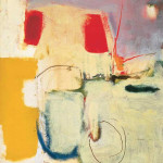
- Untitled 1950
-
- Untitled (Albuquerque) 1952
-
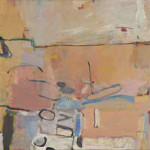
- Berkeley #3 1953
-
- Berkeley #57 1955
-
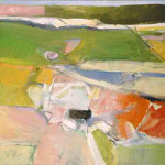
- Berkeley # 44 1955
I find a representational element in the paintings of the 1950’s after the pure abstraction of the late 1940’s, as if the essence of the world around him is now being distilled for the canvas. “All paintings,” Diebenkorn said, “start out of a mood, out of a relationship with things or people, out of a complete visual impression.” The California light is there, the browns of the California landscape, and the pastel blues of the sky. In a similar way, I find an abstract element in even his much more representational work of the late 1950’s and early 1960’s.
-
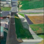
- Cityscape I 1963
-
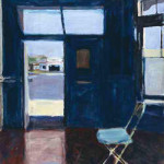
- Interior with Doorway 1962
-
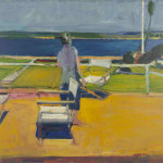
- Figure on a Porch 1959
Some critics thought Diebenkorn’s work was erratic, some called him a ‘traitor’ to Abstract Expressionism, and some simply dismissed him as no longer of being of interest. Diebenkorn had a much calmer view of the matter. “Abstract,” he said, “literally means to draw from or separate. In this sense every artist is abstract… a realistic or non-objective approach makes no difference. The result is what counts.” Timothy Burgard, the curator of the de Young, believes that Diebenkorn’s paintings always hovered between abstraction and depiction, a quality he called ‘oscillation’ and that he believes can be seen throughout the work in the exhibition. Diebenkorn has said that he turned his back on abstract painting because it became too easy for him. He needed the constraints that representation placed on him as something to struggle against.
After seeing the paintings for myself, I prefer to take Diebenkorn’s view of his evolution. “I was never throwing things away when I switched from one way of painting to another. You can see a continuum from representation to abstraction, although I must say it never felt like a smooth transition while I was in the middle of it.”
It is at this point in Diebenkorn’s career, 1966, that the exhibition at the de Young ends. In addition to the many paintings there are figure drawings. Diebenkorn worked from the live model for virtually his whole career, though he mainly saw it as a form of training. There are also various serigraphs and prints. It is wonderful work. For most artists it would have made a grand career. When Deb came out of the exhibition she was so moved by what she had seen she simply went off to take some time for reflection.
“I was never throwing things away when I switched from one way of painting to another. You can see a continuum from representation to abstraction, although I must say it never felt like a smooth transition while I was in the middle of it.”
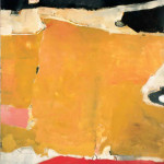
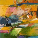
Though I meant to write only about this particular experience at the de Young Museum, I find it impossible to neglect what came next for this artist. The exhibition may end with the year 1966, but Diebenkorn’s work most certainly did not. In that year he and his wife, Phyllis, moved from San Francisco so he could take up a teaching position at UCLA. For the next twenty-five years he returned to nonrepresentational art, painting hundreds of abstractions, many of which comprise the sublime geometry of the “Ocean Park” series, so named because he maintained a studio for many years in the Ocean Park section of Santa Monica. After the years away from pure abstract painting his return is that of an artist of consummate mastery. A comparison of “Sausalito #3” painted in all its frantic energy in 1948 with the equally abstract “Ocean Park #129” and its suppressed energy beneath an outward calm speaks volumes about the distance traveled by this great painter.
-

- Ocean Park # 54 1972
-
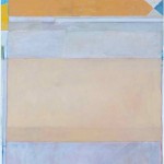
- Ocean Park #122 1980
-
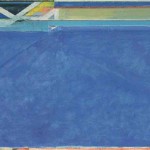
- Ocean Park #129 1984
And finally, in the very last years of his life,
Untitled #7 1991
The New York Times wrote upon his death in 1993, “From the beginning of his career, in the late 1940’s, he won admirers and exhibited widely. But the distance, both physical and psychological, that he maintained from New York tended to put him out of step with art-world fashion, and it caused either consternation or indifference in many critics. When Abstract Expressionism was ascendant in New York in the 1950’s, Mr. Diebenkorn switched from abstraction to figuration. When Pop Art made figuration fashionable in the 1960’s, he switched back to abstraction.”
Well, that’s true as far as it goes. But I see a different story playing out. I see a restless quest by a quiet man for a purity of expression that few us even know exists. The Ocean Park paintings are the magnificent culmination of this quest begun so many years before. Perhaps it is best to give Mr. Diebenkorn himself the last words:
“If what a person makes is completely and profoundly right according to his lights then this work contains the whole man. A work which falls short of this content, is only of passing value and lends itself to arbitrariness and fragmentation.”
For an audio interview with Richard Diebenkorn, visit: Diebenkorn Interview
It is a long interview and it gets off to a slow (boring) start but becomes very interesting as Diebenkorn explains his life and work in his own words. He was a precise and articulate man who was quite self aware. It’s worth the listening.
Other quotes from Richard Diebenkorn on the artistic process:
I don’t go into the studio with the idea of ‘saying’ something. What I do is face the blank canvas and put a few arbitrary marks on it that start me on some sort of dialogue.
I came to mistrust my desire to explode the picture and supercharge it in some way… what is more important is a feeling of strength in reserve – tension beneath calm.
When I am halfway there with a painting, it can occasionally be thrilling… But it happens very rarely; usually it’s agony… I go to great pains to mask the agony. But the struggle is there. It’s the invisible enemy.
Return to Artists and Their Art
Copyright 2013 James Tucker
Comments Off on Diebenkorn
Filed under Creative Process, Gallery Experiences, Notes on Art History
New York Times Magazine Photographs Exhibition
Ryan McGinley– MIA
“New York Times Photographs,” opened at The Hunter Museum of American Art in Chattanooga, TN on November 28, 2014 and runs through March 22, 2015. A shorter version of this article appeared as the cover story in The Chattanooga Pulse, December 4, 2014.
“New York Times Magazine Photographs”, appearing at the Hunter Museum of American Art in Chattanooga, engages the viewer with images of startling power and originality. Curated by New York Times photo editor Kathy Ryan and organized by Aperture Foundation’s Lesley A. Martin, this exhibition explores work published by the magazine during the last fifteen years. Over 100 photos taken by 35 photographers are organized into thirteen sections that reveal the surprising range of creative expression possible with the camera. The finest photographers from around the world explore subjects as diverse as the humanitarian crisis in Darfur, the world of high fashion, the Olympics, the war in Iraq, and celebrity portraiture. Their photo-essays invariably display the New York Times Magazine’s willingness to push beyond convention and seek a fresh viewpoint.
“To me, the process where a photographer visualizes a subject and the creative way a painter reimagines a subject just aren’t all that different. I don’t see them as two separate things.”
–Hunter Museum chief curator, Nandini Makrandi.
Thanks to the creativity of the photographers, the camera’s expressive potential is readily apparent. However, if the photography of these modern masters is individual in its vision, photojournalism itself is a corporate process. A unique feature of this exhibition is the way it documents how the photo-essays seen in the Magazine come into being, how photographers are chosen for assignments, and how, through careful selection and thoughtful presentation, a visual story is honed by the Magazine editors. We see not only published photos, but also the many that did not make the editorial cut. Tearsheets show how the photos that ran in the Magazine actually looked in print. As Nandini Makrandi points out, “Normally those editorial decisions are hidden, but in this exhibit they are brought out for the viewer’s consideration.”
An examination of some of the photographs in the exhibition will serve to illustrate how the willingness of the Magazine’s editor to take chances often results in images that are unforgettable.
For over forty years, the legendary Brazilian photographer and environmentalist, Sebastiao Salgado, has documented the lives of people all over the world with powerful black and white images. In 1991, with the U.S. and its allies about to invade Kuwait, he anticipated events, calling Kathy Ryan the day the war began to ask if he could document the environmental devastation he was sure would occur. Hurrying to the Mideast, he waited on the Kuwaiti border, as the New York Times frantically pressed authorities to allow him access to the oil fields. Days later he witnessed an inferno—over 100 oil wells in flames and workers struggling heroically to stem the disaster.
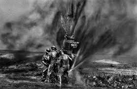
Salgado–Kuwaiti Inferno (cover) 1991
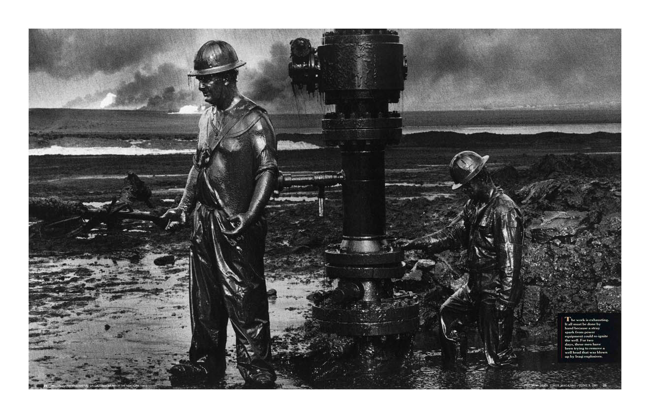
Salgado–Kuwaiti Inferno 1991
Salgado’s black and white photos are elemental in their grim power, expressing the desperate struggle of exhausted men taming the damaged wells. The classical visual compositions stand in striking juxtaposition with the battle being waged against the forces of chaos. Salgado presents us with a visual depiction of the ancient epic of human struggle against a hostile world, but sadly, he depicts a world made hostile by the madness of humans. It is a current event the photographer has raised to mythic status.
The photo-essay exploring and explaining current events has been a staple of the genre from its inception. The New York Times Magazine excels in this such long form reportage. For instance, in 2007 the magazine sent photographer Lynsey Addario and writer Elizabeth Rubin to the Afghanistan, embedded with the U.S. Army’s Battle Company of the 173 Airborne Brigade. The Battle Company soon became engaged in a 6 day mission to control Korengal Valley before the onset of winter.
-
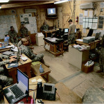
- Capt. Dan Kearney left foreground with members of his unit at the Korengal Outpost command center in northeastern Afghanista
-

- Eyes in the Sky At Camp Blessing battalion members — led by Lt. Col. Bill Ostlund far right — watch a monitor showing Capt. Dan Kearney’s troops six miles away.
-

- In the Valley– Capt. Dan Kearney.
-
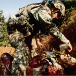
- Sgt. Tanner Stichter tends to a wounded Specialist Carl Vanderberge.
-

- Hostile Fire U.S. troops carry the body of Staff Sgt. Larry Rougle who was killed when the insurgents ambushed their squad in the Korengal Valley
-

- Elders in a village after it was bombed.
Throughout the mission, which became a running battle with the Taliban, these courageous journalists documented the destruction and suffering they witnessed. Addario photographed these grim and desperate moments in color and at close range, giving her images the look of snapshots. It’s a quality that conveys a sense of intimacy and immediacy–the sense that events are unfolding in real lives even as we read. Such an unblinking look at the specific moment raises her work toward the universal. These two veteran journalists, a writer and photographer, address in their work the humanity of all the participants: the warriors who fight and die as well as the civilians who suffer beside them.
In 1997, for a very different project, “Assignment: Times Square”, the magazine assembled a roster of 16 photographers, each of who could bring a very different eye and sensibility to the story. At that time, the Times Square neighborhood was on the edge of a complete transformation from its seedy past, and the editors wanted to capture a sense of the storied place. The resulting photo shoot produced an astonishing variety of images: city streets, buildings, portraits, and genre scenes. Swedish photographer Lars Tunbjork’s photo of the buildings at the corner of 8th Avenue and 42nd Street is timeless. “Forty-Second Street at the time was a strange place,” writes Tunbjork, “with all the abandoned cinemas and porno palaces—like a big empty theater set. I took this picture on a sunny Sunday. I love sunny Sundays in New York; the air is clean, and the light is so crisp and hard. I thought of the paintings of Piet Mondrian when I saw these buildings and the strong colors.”
- Lars Tunbjörk– “42nd Street and Eighth Avenue”, published May 18, 1997
In addition to giving considerable creative control to its photographers, the New York Times Magazine’s Kathy Ryan also likes to do ‘cross-over’ assignments, asking photographers known for their deft handling of one subject to photograph something different. An example is shown in the assignment given to Roger Ballen. Known for his dramatic and disturbing surreal images, Kathy Ryan chose him as a photographer for a fashion shoot. Ballen worked with actress Selma Blair to produce, “The Selma Blair Witch Project: Fall’s Dark Silhouette has a Way of Creeping Up on You.” The photograph, “Resemblance”, at once creepy and funny, has Blair, dressed in designer clothing, inhabiting an image both enigmatic and psychologically charged. It is an revealing rumination on the nature of fashion. Stripped of its special environment of runways, supermodels, and fashion journalists, the designer clothes wilt and become rather ordinary in the utterly bizarre settings that Ballen conjures up. Not surprisingly, Ballen noted, “I won an award for that fashion shoot but no one has asked me to do another one.”
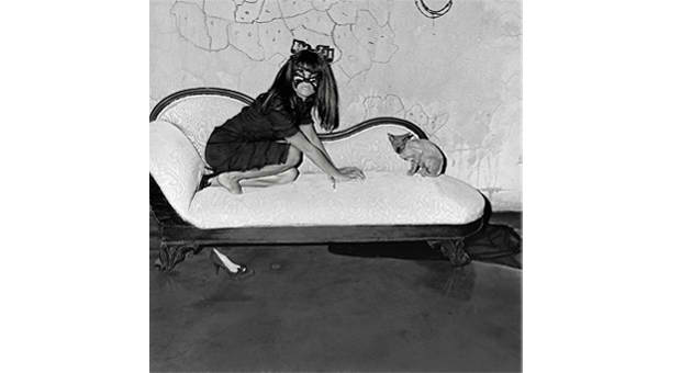
Roger Ballen, Actress Selma Blair. From “The Selma Blair Witch Project– Fall’s Dark Silhouettes Have a Way of Creeping Up on You,” 2005
In yet another example of the Magazine’s creative thinking, assignments sometimes go to artists who are not photographers. Artist Chuck Close’s photos appear in ‘Assignment: Times Square’ and Jeff Koons, a sculptor, worked with actress Gretchen Mol to recreate Bettie Page images from the 1940s and 50s in which sexual fetish imagery is presented in vivid color and filtered through Koons’s tongue-in-cheek humor.

Jeff Koons–
“When you’re looking at a Jeff Koons photograph,” says Nandini Makrandi, “you’re not necessarily looking for him to be a technically excellent photographer. The interest is in how he translates the vision he is known for into the medium of photography? Is his puckish sensibility and his sense of humor present in his images?” Koons presents the viewer with photographs in which eroticism blends into absurdity. The eye is caught by the garish color and provacative poses, only to have the response end in bemused laughter.
Why not send a veteran war photographer to photograph the Oscar-worthy actors one year? Or commission a gallery of Olympians by an artist with a very personal iconography, rather than by a sports photographer?
–New York Times Magazine photo editor, Kathy Ryan
-

- Paolo Pelegrin– The Exodus
-

- Paolo Pelegrin– Cate Blanchette
Paolo Pelegrin’s work would hardly be called puckish. The exhibition contains three photo-essays that Pelegrin has done for New York Times Magazine over the last fifteen years. We see his photography move from film to digital, but always his work has what Kathy Ryan has called “a poetic sensibility.” In his 2002 essay, “An Impossible Occupation,” he tells the story of a platoon of Israeli soldiers on duty in Palestinian territory. His 2004 photos in “How Did Darfur Happen?” explored a humanitarian crisis. “The Exodus” from 2009, documents the flight of Libyans across the border into Tunisia and displays his ability to deal with large events in terms that are both immediate and empathetic.
However, true to her inclination to offer photographer cross-over assignments, Ryan asked Pelegrin to photograph Hollywood celebrities for the magazine’s article on in the the yearly run up to the Oscars. Pelegrin’s images are not what a viewer has grown used to in such stories. They portray the famous in mundane moments. And taking it even farther, he often imposes jarring compositions on his images or skewed camera angles. They are visual devices that draw attention to the artifice of the celebrity life by isolating moments when artifice has failed. No words can explain this approach better than simply comparing the photos of Cate Blanchette by Pelegrin and Rincke Dijkstra. If Dijkstra’s image gives us a sense of the fragility of the celebrity’s world, Pelegrin shows us the unflattering private preparation that must precede the public moment.
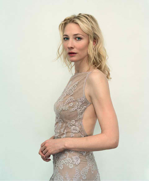
Rincke Dijkstra–Cate Blanchett
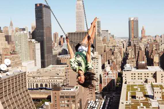
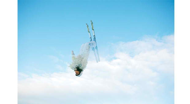
The brilliant young photographer, Ryan McGinley, had previously worked with subjects such as skateboarders, musicians, and graffiti artists. His assignment to photograph Olympians was a challenge to transcend the banal. His talent combined with the resources provided by Kathy Ryan created images of lasting beauty.
“One of the fun examples of cross-assigning can be found in the Olympic portfolios Ryan McGinley has done.”
–New York Times Magazine photo editor, Kathy Ryan
The Magazine contracted with the design team of Rodarte to provide special outfits for the athletes. McGinley came up with unique camera angles and compositions. Thousands of photographs were taken, and a visual story evolved that goes far beyond appearances to reveal the very essence of what these uniquely trained people are. In his incredible photo of the free-style skier, Emily Cook, McGinley captures a moment in the performance of a sport that routinely sends skiers soaring into the sky; so Emily Cook is shot against the sky, soaring into the sky, becoming the sky. She defies physical laws, hovering as an ethereal being above the common world below. It is a visual manifestation of how she feels at that very second. It is a glorious moment in the art of the camera.
Copyright 2014 James Tucker
Return to Artists and Their Art
Comments Off on New York Times Magazine Photographs Exhibition
Filed under Creative Process, Gallery Experiences
Things Like That Just Happen in a College Town
Pen & Ink sketch 2/11/2010
I was fresh out of the University of Georgia and trying to make a buck or two while the future figured out what it was going to do with me. In a quixotic attempt to survive as a freelance commercial artist, I’d done a drawing for a guy who was trying to talk another guy into building a greenhouse. It was an architectural rendering of sorts for which, if my memory is correct, I was paid in beer. Sort of gives you an idea of how things were going with my career at that point. However, as fate would have it, that drawing was seen by two other guys who ran a stereo shop. They approached me about doing some pen & ink drawings for a new sales flyer. The previous ones had been done by someone with a pretty good pen & ink technique, but he had moved away, disappeared, vanished. Things like that just happen in a college town. So the owners showed me some of his work and asked me if I could draw like that. “Sure, how many you want?” I said, and we struck a deal. I’d make a couple of drawings and they would decide if I got the rest of the job. Either way I got paid for the trial run—and not in beer. It was a good deal for everyone.
But of course I was lying.
It isn’t easy to get ahead when you’re young and short on experience. Sometimes a certain mangling of the truth is necessary because the questions you get asked are usually wrong. They ask if you know how to do something. They should ask if you could figure out how to do it. I like to think I wasn’t lying so much as re-imagining their question. In the years since, through several professional reincarnations, I’ve learned an important truth. Most jobs don’t require much more than a willingness on someone’s part to do them. I suppose I’d want a surgeon to be telling the truth about medical school, and an airline pilot shouldn’t try on-the-job training, but most jobs? Hell, you just fake it for a few days until you get the hang of it and you’re in. Management provides almost limitless opportunities for this approach. In the case at hand, the truth was I didn’t have any pen & ink technique. And the truth wasn’t going to get me the job.
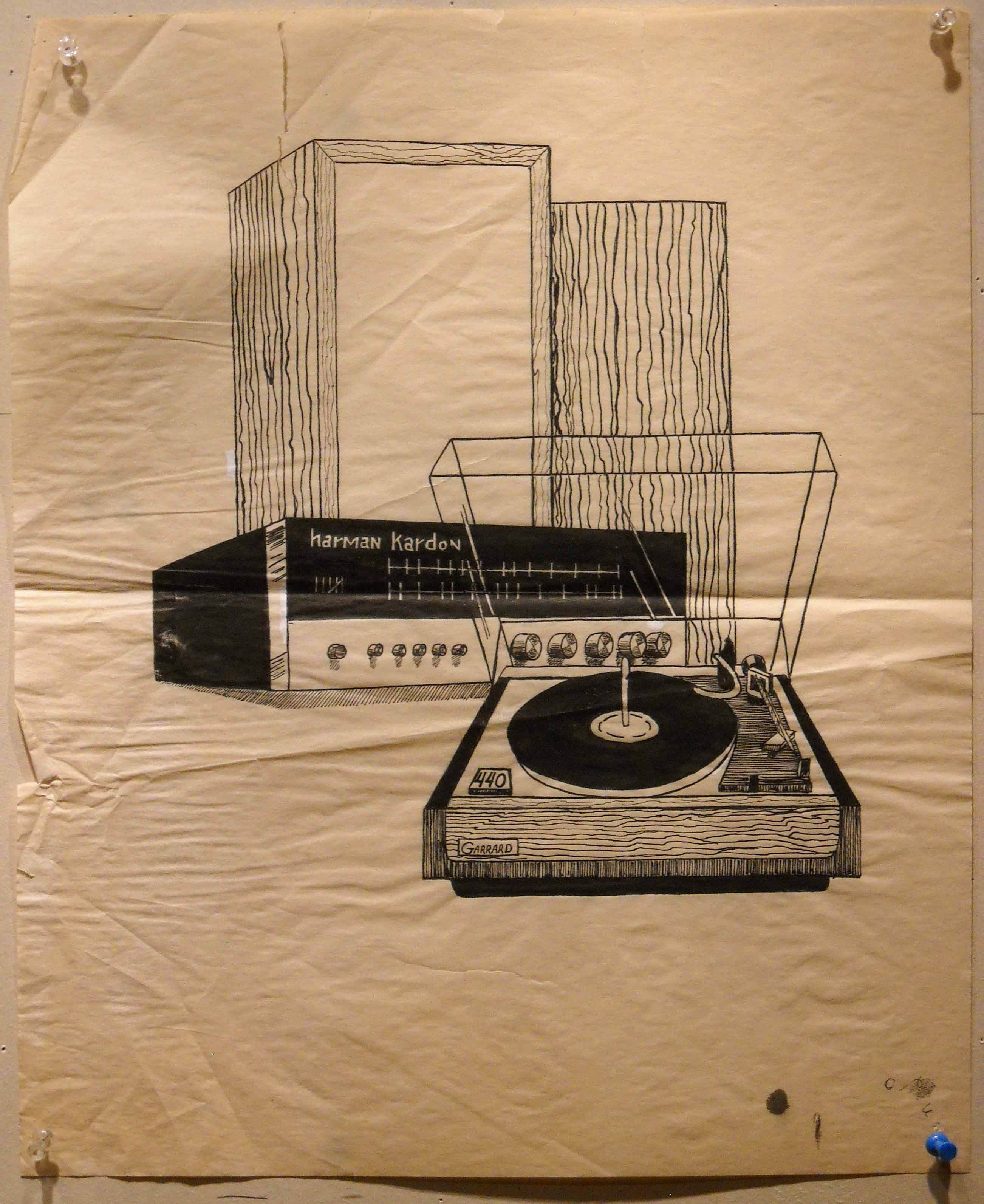
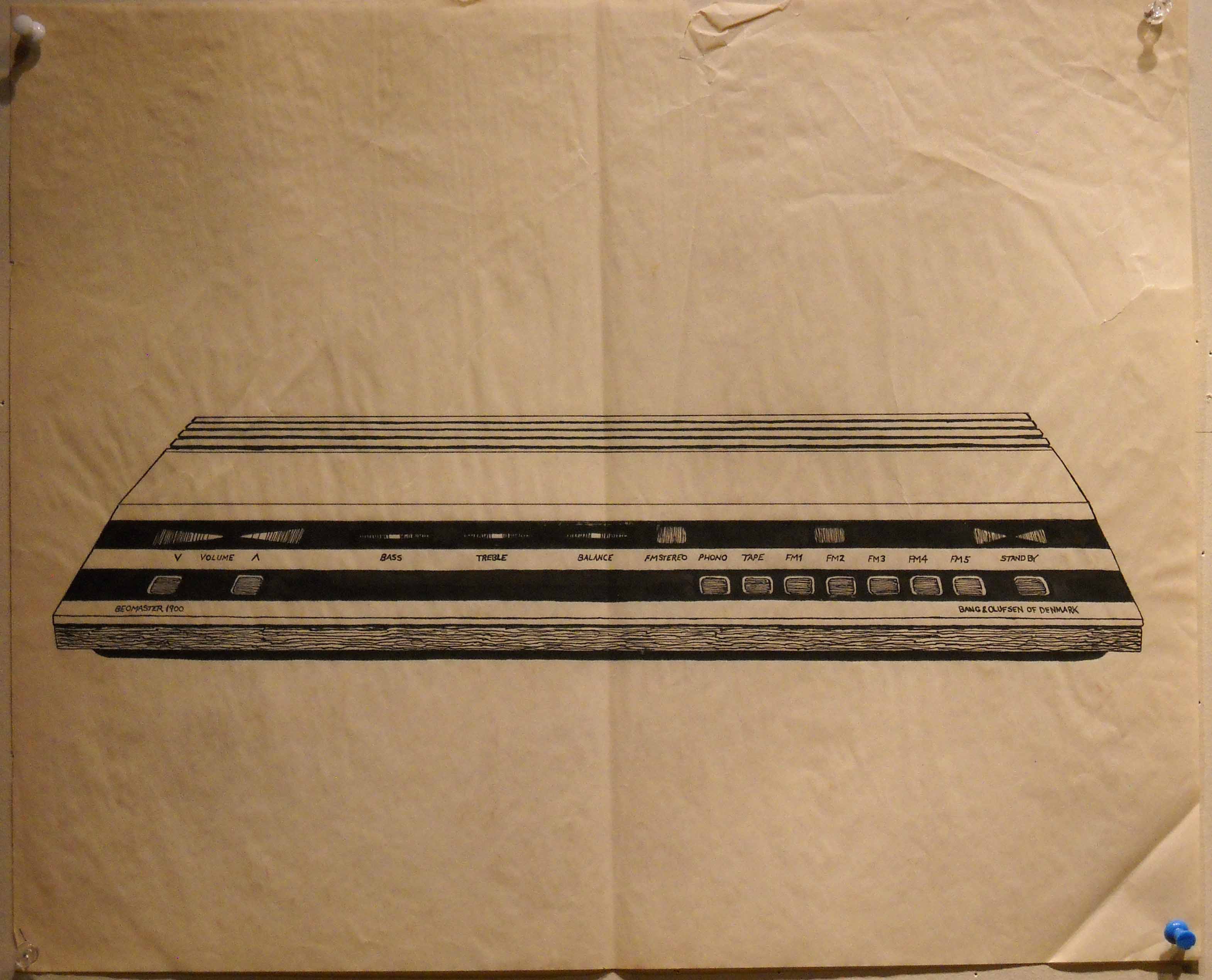
So I started the whole project from scratch. I went out and bought a pen, some nibs, ink, and a type of paper a friend recommended. I had some of the drawings made by my predecessor that the stereo guys had left with me, so I sat down in my apartment and began to draw various objects a la stereo sales flyer.
As I worked, I noticed some things about the other guy’s drawings. They were fairly large, larger than they would be when reproduced, which would tend to hide small errors when reduced for publication. Though he didn’t get carried away with it, he wasn’t afraid to correct now and then with Wite-Out. Finally, he kept his drawings rather simple and uncluttered by unnecessary detail. His work was compact and to the point—sort of a Sgt. Joe Friday, “Just the facts, ma’am” approach.
After a few days practice, the time came to show the my possible employers what I could do. The stereo guys gave me a desk in an office above their shop, brought in a turntable and a tape deck (that dates the story, doesn’t it?), and I made ink drawings of them. At the end of the day the owners had two drawings and I had a job.
I worked off and on for a couple of weeks doing the drawings and they were happy and I was happy. Recently, going through an old moth eaten portfolio, I found two of those drawings. I make no claims for them other than I got paid, and naturally they aren’t at all like what I do today.
I tell you this little story because, as always, there were unintended consequences. The stereo guys ended up hiring me to sell equipment for them, which meant a steady paycheck for a while. Much more important, over those few weeks I fell in love with pen & ink. I’ve been working in that technique, usually on my own time, ever since. I never tire of its dramatic tonalities and the discipline the pen requires. It’s what I imagine acting would be like with a minimalist set design, or singing a cappella. And of course, when you show your drawings in a gallery there’s no using Wite-Out.
The shop owners later told me that they had approached another artist to do the drawings before they came to me. This artist said she would send around some work for them to review. A week or so later they got a drawing of a nude woman lying next to a stereo speaker, her legs spread, with musical notes coming from her vagina. When they told me that, I didn’t know quite what to say. I suppose if you’ve re-imagined the truth to get a job, it helps that the competition has traumatized the buyers.
But things like that just happen in a college town.
Copyright 2013 James Tucker
Comments Off on Things Like That Just Happen in a College Town
Filed under Creative Process
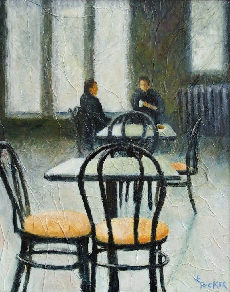
An Anatomy of a Pen & Ink
I like making pen & ink drawings. I fell in love with pen & ink a long time ago and can’t see giving it up any time soon. You can find the story of my early days working in pen & ink elsewhere on this website in, Things Like That Just Happen in a College Town.
What follows in this essay is a description of how I went about making the ink drawing “The Wayfarer II”. To those who are not artists it may offer a chance to see what goes on prior to the presentation of the finished artwork on a gallery wall, rather like attending rehearsals for a play. However, please don’t think mine is the only way, or even the best way, to go about the development process. It is my way and that’s all I can offer. I took photos periodically as I worked on the drawing, and those, along with an explanation of what is going on, should give some idea of how I proceed from idea to finished artwork.
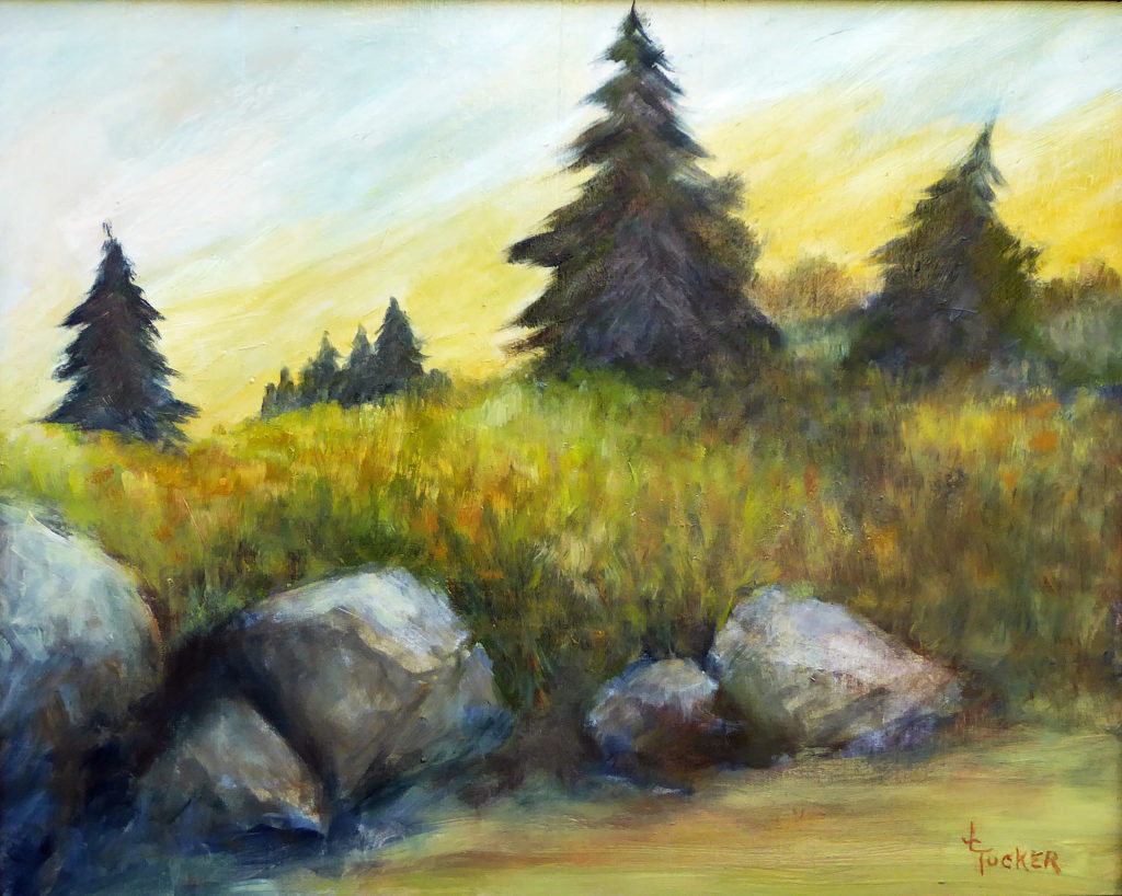
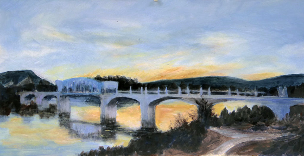
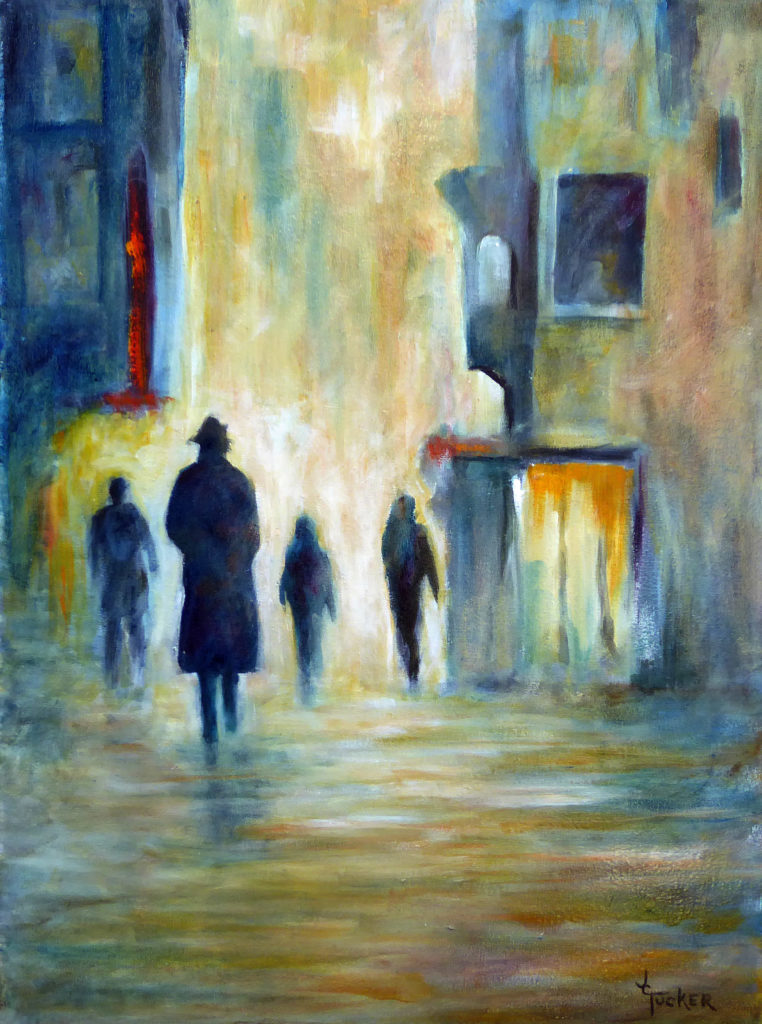
To start, here are a few other examples of my work in this medium:
Gallery I of recent ink drawings
-
- Trainyard 7×4.5 Pen & ink on Bristol Board
-

- Morgana 5.75×6.75 Pen & ink
-
- Night Sailing 8×10 Pen & Ink on Bristol Board
-

- Entre Nous 10×8 Pen and Ink wash on d’Arches HP
As an artist I tend to think in terms of tonality and have never been bothered by the lack of color in monochromatic artwork. Of course ink drawings need hardly be monochromatic. If color is what drives your world, inks are now made in a dizzying array of hues, but as for me, black ink against white paper is good enough to realize my goals for many subjects. Pen & ink is a simple medium, a challenging medium, and one that encourages a thoughtful approach to its limited means. When you add the subtle grays possible with ink wash drawing, the creative possibilities are near limitless.
As for me, black ink against white paper is good enough…
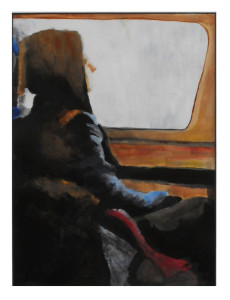
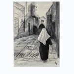
“The Wayfarer 1” 9×7 Acrylic on D’arches CP– Private Collection
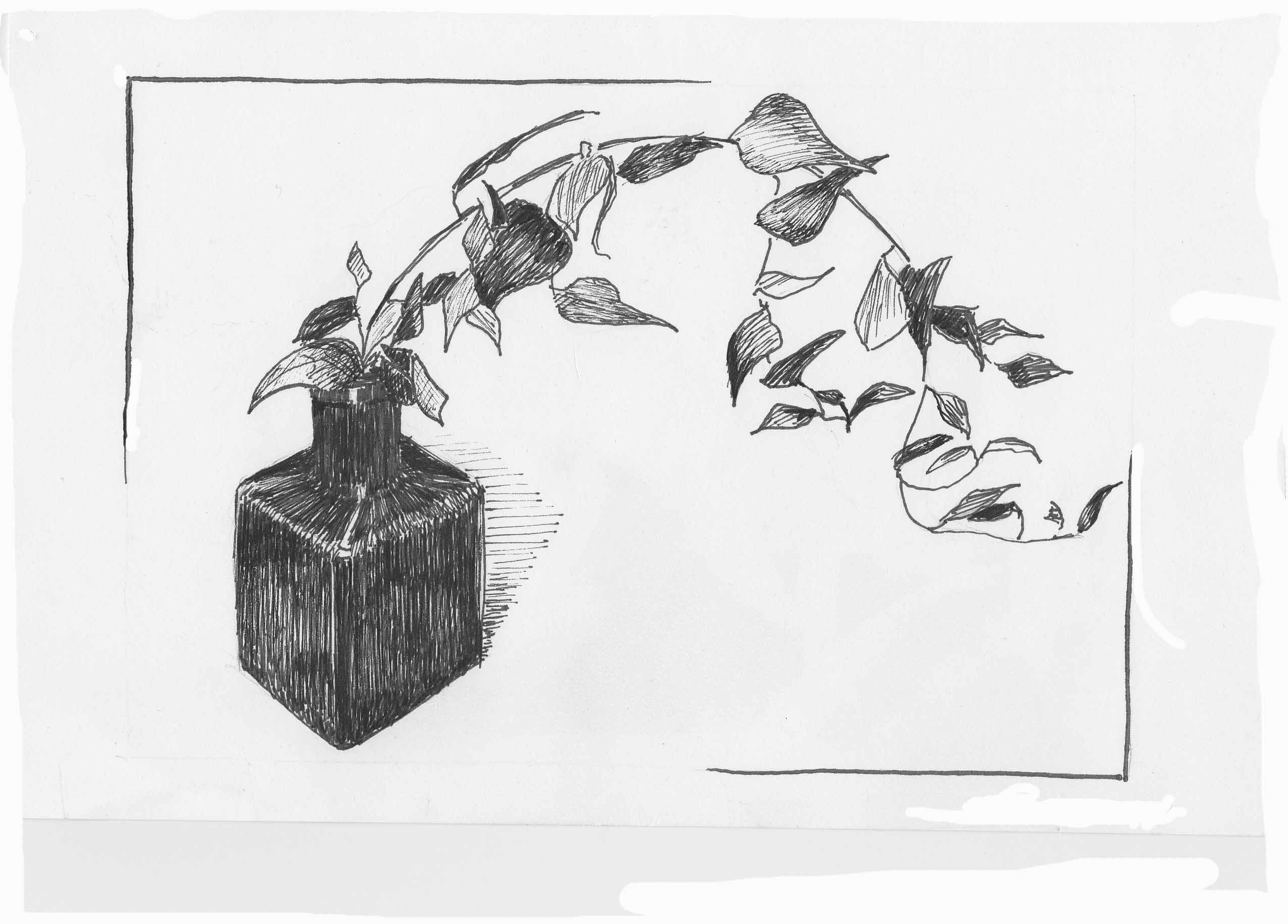
The pen & ink drawing I’ll be discussing has its origins as part of a series meant to evoke the loneliness of the traveler. I’ve traveled a good deal over the years, and it can be an emotionally solitary experience. People move about, boarding planes and trains, lost in their own private worlds, dwelling in a space apart. While in Montreal with my wife, Deb, we hiked (really it’s just a walk) to the top of Mont Royale where we found a large visitor pavilion. The October day was somewhat brisk, and we each got a cup of hot chocolate to take outside and drink while we enjoyed the view. As I waited on Deb to get her cup, I looked around the large building, likely constructed 70 or 80 years ago, and noticed small groups of people gathered at tables here and there, overwhelmed by the vast space. Struck by how much the place reminded me of an old train station, I snapped some quick photos before we went off to sit on the terrace with our warm drinks watching our fellow tourists puff their way up the pathway.
Reference photos for drawing


When we got home, I eventually went through the photos taken at the pavilion and selected a few to work with. None of them was well composed (my wife is the photographer in the family), but they all evoked for me a sense of the lonely, emptiness of a large train station.
Though the majority of the pieces planned for the “Wayfarer” series were to be smallish paper-based paintings, it just felt right to do this one in pen & ink. I can’t tell you why. Sometimes a subject just seems to call out for a certain treatment, and once you get that into your head, you just can’t see it any other way. I also made a decision early on to make the drawing relatively large, influenced, perhaps, by the space that inspired it.
Using elements from the photos, I made some quick compositional sketches. From these, I then worked up a preliminary drawing, something I don’t always do. There is often a great deal of charm in work done quickly without a lot of preplanning. However, this drawing would be too delicate in its tonal and compositional relationships to be approached that way. Work like this needs to be carefully thought out. Besides, my studio is a long way from Montreal, and I only have a few quickie photos to work from.
For other comments on the shaping of raw visual material into art, see: Frank Wilson’s Pasture
Here is my preliminary drawing.
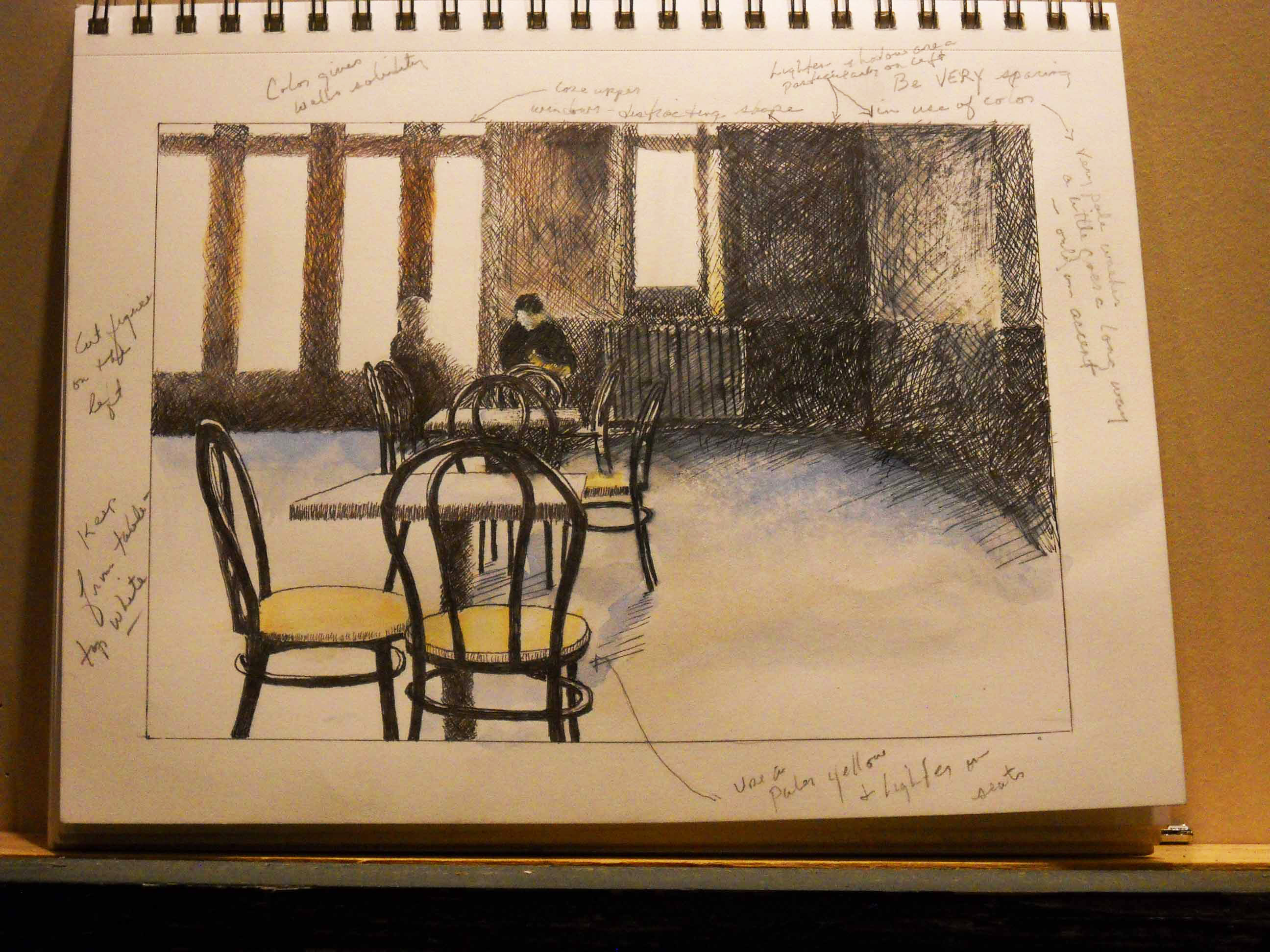
Study for “Wayfarer II”
Looking at this photo made from my sketchbook, you’ll notice lots of notes in the margins and even on the drawing itself. After I complete an acceptable preliminary drawing, I prop it up where I can see it and work on something else for a while. It takes time to see things objectively. Each day, as I move around the studio, the number of marginal notes grows as I notice little problems, consider alterations, or come up with improvements. Notes are better than changes to the drawing because they allow me to remember what I wanted to change without getting the preliminary all muddied up with corrections. And these notes are important, because I’ll be working from this preliminary realization of the subject as I do the final drawing.
The need for the fairly detailed study arises from other considerations as well. Since I’ll be using stark blacks in the foreground, the drawing needs to be satisfying. I don’t want the viewer’s eye to stop at one of the chairs and wonder if the drawing is correct or to get bogged down in a cluttered mass of lines. Further, there must be a good rhythm in the placement of the chairs so the viewer’s eye moves smoothly to the figure in the back (the star of our show). These are important issues, and the final drawing is not the place to figure any of them out. Granted, many of these considerations were dealt with in the compositional sketches that began the process, but they have now been realized in a semi-finished state that allows for a more thorough evaluation.
… the key to working with photos is to not work directly from photos.
I think the key to working with photos is to not work directly from photos. Art can be broadly defined as the communication of ideas or feelings by visual means. The problem with the camera is that the visual information it gives you still needs to be shaped and molded to the artist’s intent. When a photo achieves that state, it’s then art. That is why photographers are artists—they are capable of shaping the image both during the shoot and during editing, be that in the dark room or on a computer. But most photos (especially mine!) are just dumping grounds for visual information and must be used as the jumping off place to begin a piece of artwork. Preliminary drawings are where that editing process occurs for me. Elements need to be moved, or need to be cut, or need to be enhanced; in short, the visual material from the photo must be made to express my intentions. This mound of visual “facts” must be shaped to my goals. That’s why for me, poor quality photos are best to work from, because they force me away from imitation.

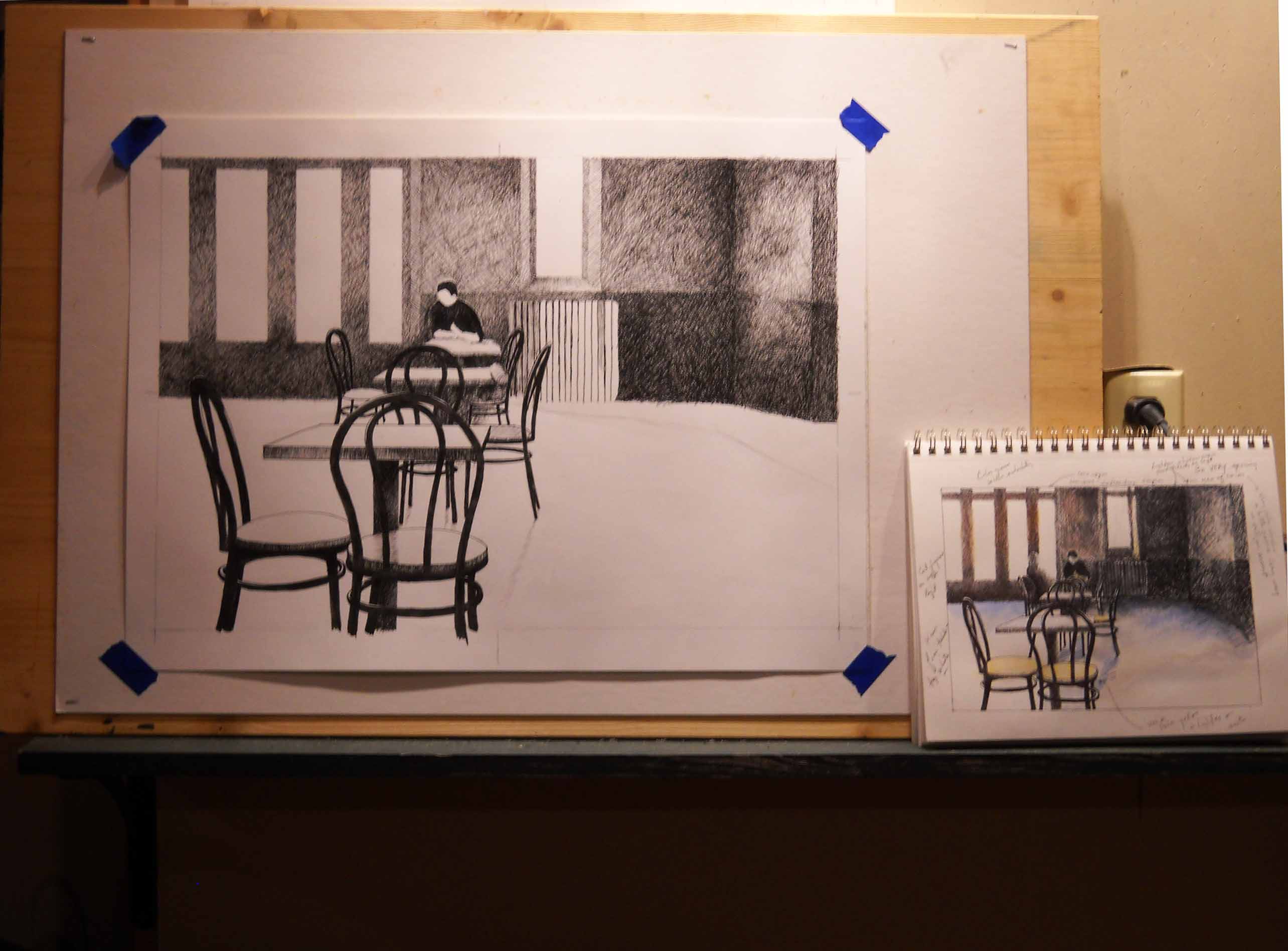
Beginning the final drawing
Above is the beginning of the piece. Since they are hard to see in the photo above, I’ll point out some of the differences between the preliminary drawing and the one in progress. In my early thinking, I had two groups of figures located at two different tables. However, by the time I made the preliminary drawing, I had reduced reduced this number to two people sitting at one table. Now I cut the less important figure out (note to new artists: improving composition almost always means cutting things out). Only the solitary traveler is left. The perspective has been subtly altered to further emphasize the empty chairs and the viewer’s distance from the figure. At this stage, the background is rather lighter than it is in the study and even lighter than it will be when I get finished, but I know that the chairs will be full strength black and I’ll have to balance the background with them, since I can’t do it the other way around. Lightening a large inked area is not practical, so I left enough tonal “wiggle room” to adjust it later. This approach also works with my intention to make the background shadows lighter and more nuanced in the final drawing.

The foreground chairs are added
And now the foreground chairs are added. The tonal axis of the drawing will lie between the black of these chairs and the seated figure. My goal is to have the viewer’s eye thrust into the scene, and I’m using several means toward this end. The tonal axis shoots straight back to the traveler, the main chairs line up toward him, and the white of the windows and the grays of the wall frame him. That sense of thrust is something the preliminary study needed enhancing. In order to better judge if that effect is coming off, I’ve propped a frame on the drawing to give me a better sense of the pictorial space.
Adding the figure
The last key element in the composition, the seated traveler, is put in. This is the moment of truth. If the drawing works at this point I’ll finish it. Composition is the skeleton of any drawing or painting; it’s the foundation on which everything else rests. There are many things in an artwork that can be “fudged”, but if the composition, the elemental basis of the piece, is flawed, there’s not much help for it. Though much still needs to be done to this drawing, if it isn’t working at this point, I’ll rip it up and pour myself a whiskey. Maybe two. Tomorrow is another day.
However, I’m not unhappy with the drawing at this point, though there is still much work to be done. The shadows along the floor at the back wall have to be brought forward and softened. The old radiator behind the figure requires definition, and there are many small touches needed in the tables. There is also the matter of deepening the shadows on the back wall in order to bring that large area into a better tonal balance with the chairs. Nevertheless, barring a really stupid decision on my part (and like all artists, I’ve had my share of those) the final drawing should be close to my intentions when I began it.

Final stage of “The Wayfarer II”
As in the preliminary drawing, I floated on a couple of watercolor washes, tinting the image to convey a sense of the cool autumnal light filtering through the large windows. Further, these washes set up one more juxtaposition—a warm/cool contrast of the red brown and the blue. The blue in this photo reads a bit stronger than is the case in the original but you should get a reasonable idea of the finished product.
So there it is. We’ve gone from hot chocolate in Montreal to a drawing made in Tennessee. And because I so like work done with pen & ink and in ink wash, I leave the reader with a gallery presenting a few more examples of the possibilities for this medium.
Copyright 2015 James Tucker
-

- “Frank Wilson’s Pasture” 9×24 Pen & Ink of Bristol Board
-
- “Arabesque II” 8×6 Ink wash
-

- “Feed Mill—Laurel, MS” 8×10 Pen & Ink on Bristol Board
-
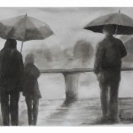
- “Rainy Day Monologues” 8×10 Ink Wash
-

- Early Morning Mist– Fishing 6×8 Ink wash on Waterford CP –Private Collection
-
- Waiting 5×7 Pen & Ink on D’arches HP Private Collection
Comments Off on An Anatomy of a Pen & Ink
Filed under Creative Process
Ancient Art
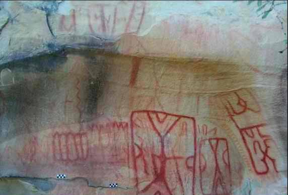
I was recently sent an article about the discovery of 5,000 pieces of rock art located in 11 locations in Mexico. Said to predate Spanish rule, they would appear to be somewhere between 600-1,000 years old. Usually I’m intrigued by such discoveries, but this time I was unmoved. My first thought upon seeing them was that they were made by bored pre-Columbian children.
That’s not the first time I’ve felt this way about ancient art. In 1998, on a trip out west, Deb and I hiked a petroglyph trail in Arizona with our kids, Molly and Andrew, and we saw various shapes and figures scratched or crudely chiseled on boulders. Nice hike, but I wouldn’t do it again for the art.
However, before the reader condemns me as a philistine, I must say that I have found some ancient art to be immensely powerful. In 1999, this time without the kids, Deb and I traveled to the Dordogne region in France. The Dordogne River valley is one of the most beautiful places on earth and the limestone caves and caverns along the river’s banks made natural dwellings for early humans. Evidence of humanoid occupation dates back 400,000 years, and beginning 25,000 years ago there is evidence of art.
Our visit to the Grotte de Font de Gaume was all Deb’s doing. She loves to travel, plans well, and we always have a wonderful time. She has taught me the advantage of seeking out local people and getting their suggestions about what we should see and do. It is Deb who finds the hidden gems, and sometimes facilitates the unusual moments and encounters, that make our trips memorable. I tell you this so you’ll understand that I’ve learned to trust her. “We must,” she said, “visit the Grotte de Font de Gaume.” “Really?” “Really!”
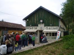
The first thing that strikes the visitor upon arrival at the grotte is how simple and straightforward everything is. There is a small gift shop and ticket booth. That’s it—no Font de Gaume burgers, no Friday night light show extravaganza, and no theme park with a special train to spare fat Americans the need to walk.
We were very lucky going there when we did. Access to the cave is restricted and travelers must book tours well in advance, which from what I’ve recently read on the Internet is almost impossible to do, as so few people are now allowed in. Indeed, the most famous of these caves, Lascaux, has been closed to visitors for years and what one visits is Lascaux II, a man-made replica. Though it is astonishing in its accuracy and fidelity to the original, it seems to me like traveling to the Sistine Chapel but viewing a clever copy of Michelangelo’s fresco located in a nearby warehouse. The Grotte de Font de Gaume is the real thing and Deb was right to take us there.
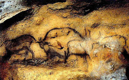
I quote now from a journal I kept at the time. What the writing lacks in polish I think it gives back in immediacy. The pictures were gathered from the Internet, since for reasons that should be obvious to the reader, no photography is permitted in the grotte. Sadly these photos, good as they are, provide little of the power and mystery of what one sees inside the cave, nor do they give any sense of how the images seem to change and move in varying levels of light.
It was only a half hour drive to the town of Les Ezyies where the grotte is located, and we arrived early. Deb had made reservations in the States and it’s just as well she did since people were being turned away when we arrived. Only a limited number of visitors are allowed in the caves each day because carbon dioxide and moisture from their breathing can, and have, caused the cave paintings to deteriorate. Most sites of prehistoric art are closed for just his reason but Font de Gaume is still open. I suspect it won’t remain so.
The cave is cool inside and of constant temperature. Perhaps that is what has allowed the artwork to survive all these years. A sign told us to wear warm clothing but the word came too late for me. The day was an extraordinarily hot one and I had brought no warm clothing along. Luckily I’d left my navy blue blazer on the back seat of the car. I must have made an interesting sight marching into the cave through its small entrance in khaki shorts, hiking boots, and a dinner jacket!
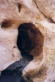
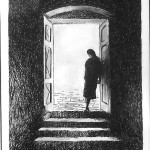
The entrance to the grotte
Our guide, who spoke only French, was in his late twenties or early thirties, handsome, and charming. It was clear that the mystery of the cave held a powerful spell over him. I could not understand what he said, my French is far too weak, but his eyes lit up and his voice dropped to a whisper as he described the creation of the amazing paintings we were viewing. There was no mistaking his feelings. Indeed, those feelings affected us all.
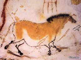
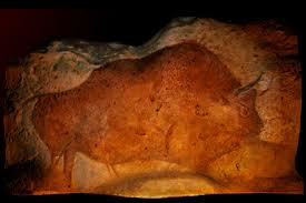
Deb, whose French is excellent, dutifully whispered a translation to me when she could. No one knows much about the ‘why’ of the paintings, but a little is known of the ‘how’. The images were clearly planned in advance and they utilize the natural contours of the cave walls to produce something of a three dimensional effect. Some of the images are rather high up and some at knee level. All the images are of animals and nearly all are of game animals. Only one, set away from the others, is known to be of a predator, a kind of cat, but two other images may also be of predators. The animals are grouped in herds and in some cases interact with each other, licking one another. The images often show a sense of perspective. The pigment —they used only two, red and black —was blown on to the walls through hollow bones. In some cases small amounts of chiseling was used to enhance the three dimensional effect, though in most cases the effect was gained by using the cave wall contours. Finally, though the paintings were faint and one would assume a bright light was needed to see them best, it was only when our guide turned down the minimal cave lighting to the level of torchlight that the animals leapt from the walls and truly came alive. Of course the dim light explained the use of only two colors. In such lighting the artist would have been working in tone and not color.
Much about the paintings remains in the realm of speculation. Why were the pictures made? Who made them? What are the meanings of the groupings of the animals and why these specific animals? These and a thousand other questions could be asked and not answered.
Deb and I did have some thoughts on the matter. Deb was struck by the sexual appearance and symbolism of the caves, of how the narrow vertical passages reminded her of female genitalia. Perhaps, she suggested, the images were meant to ensure the fertility of the herd animals on which these peoples depended for food. However, no evident remains of any religious ceremonies or sacrifices have been found, which seems odd since there are no signs of people living in the cave, suggesting that it may have been reserved for some special use. I wondered whether the symbols were mainly preventative, meant to keep evil from the animals and ensure the continual supply of meat and game. Life in that bountiful valley must have been good for the times since where else but in a fertile land could such a fledgling society spare the human effort to make such images? Indeed, I wondered if women, perhaps priestesses, hadn’t made the paintings since it was their bodies that were associated with fertility. Deb thought not, saying that man places sperm in the woman and ancient man had likely placed the images in this womb of the earth. I suppose no one will ever know the truth of the matter. The answers died with these brilliant early artists. Font de Gaume is a good place, a holy place.
There ends my journal entry. On a subsequent visit to France in 2009, this time to the Medoc, we were spending a day in Bordeaux before we flew home to the States. The morning we were to leave, Deb wanted to go to the Musee d’ Aquitaine, primarily to see the Venus a la Corne de Laussel, a bas-relief from the region where the Grotte de Font de Gaume is located. The Venus dates from 25,000 years ago, and is one of the oldest sculptures ever found.
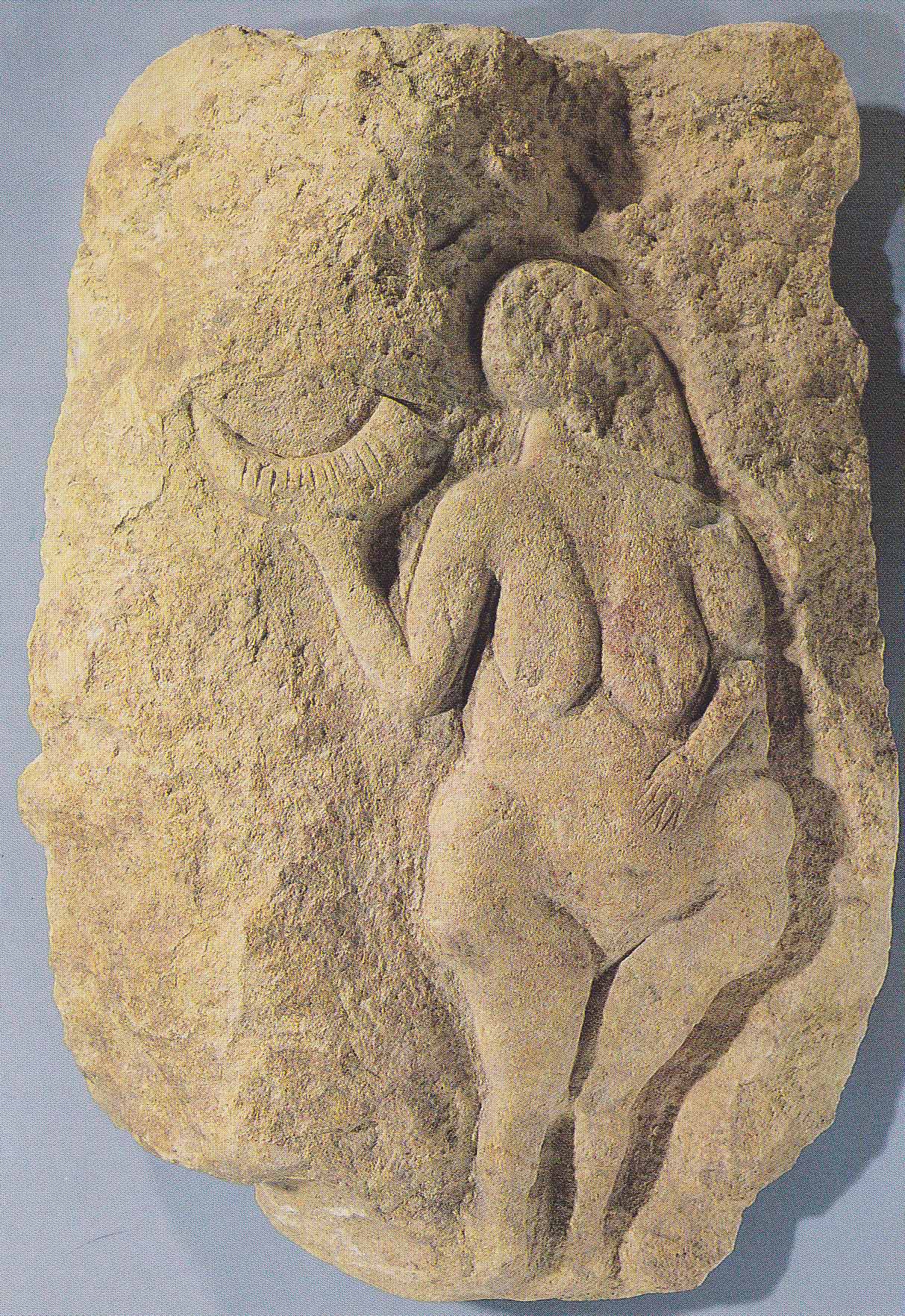
This Venus supports the idea that fecundity was a principal motif of paleolithic art. The woman depicted appears to be pregnant, but even more to the point, she is shown as a ripe fruit, a bringer of much needed life. Certainly the image is symbolic. Living in small bands and tribes, scrambling from place to place, fleeing from predators; it is hard to believe that a real woman living at the time looked anything like this sculpture. It is instead an evocation of the very powerful idea of fecundity. An abstract idea, perhaps, but in early humankind’s daily struggle against extinction I think it would be very hard to overestimate the importance of the pregnant female. She is a physical manifestation of the renewing process of birth during a time of frequent death. I do not find it hard to imagine that the Grotte de Font de Gaume is also a temple to this idea.
Return to Artists and Their Art
Copyright 2013 James Tucker
Comments Off on Ancient Art
Filed under Gallery Experiences, Notes on Art History
The Amazing Mr. Turner
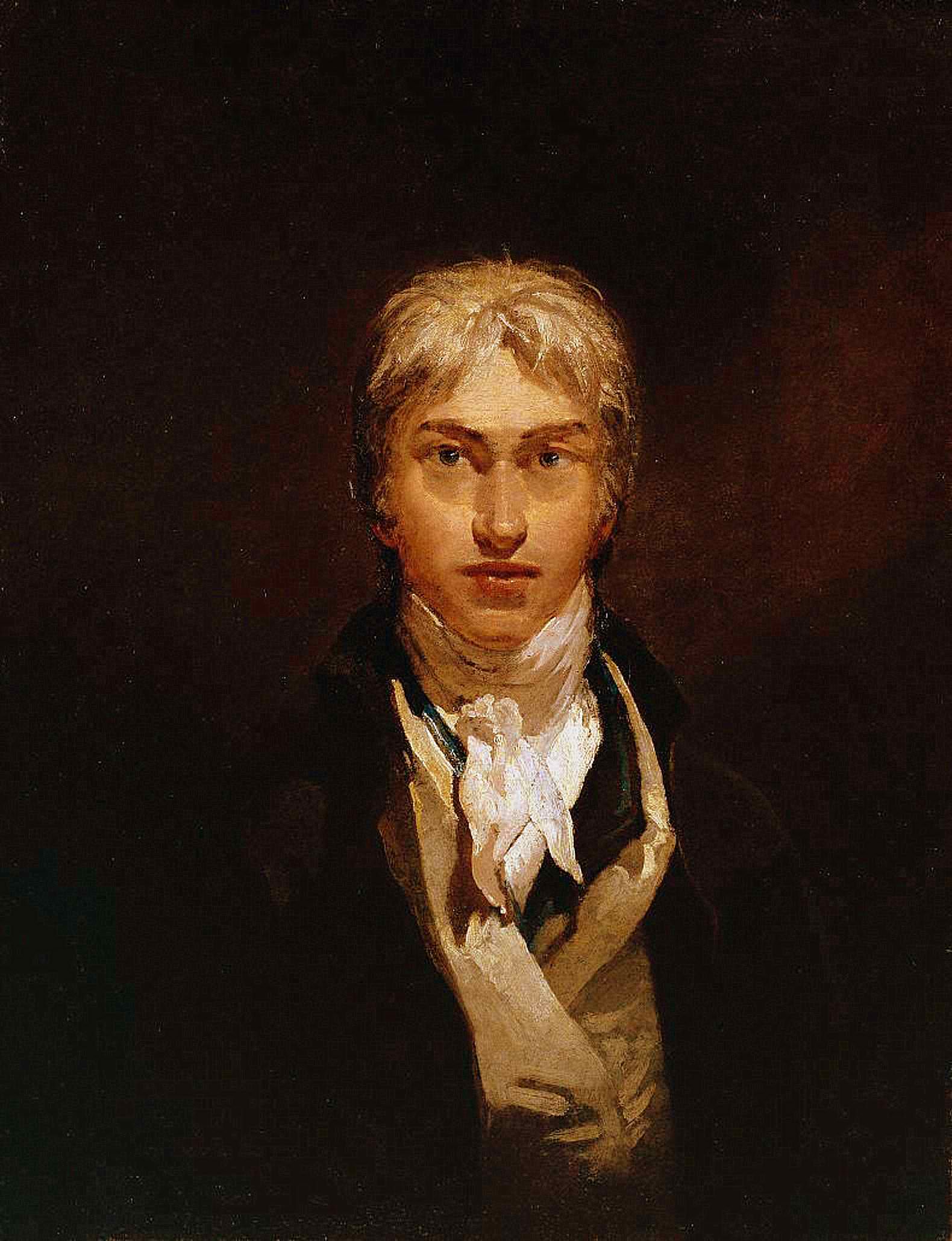
JMW Turner (1775-1851) Self-portrait (1799)
Once some years ago, when I was roaming the stacks at the University of Georgia library, I was struck by the titles of two books shelved side by side. One was entitled The Pre-Raphaelite Tragedy; its companion announced The Pre-Raphaelite Comedy. Though I read neither book, the juxtaposition suggested there was something gone wrong about the Pre-Raphaelite movement, or the “Brotherhood” as they called themselves. At least I’ve always seen it that way. There is too much mere illustration going on combined with a reverence for the myths and ballads of the medieval world. It is a “Pugin-esque” fantasy that has little resonance for me. Still, as my knowledge of their art was based on what I’d seen in books, I felt I owed them a first hand look. Art must be seen in the original as it was intended to be seen, or it’s really not seen at all. That is why, in the fall of 2012, being in London, I found myself in at the Tate Britain, patiently shuffling past paintings by Rossetti, Millais, and Waterhouse, drifting in a human current of school children, tourists, and pensioners. As I moved through the crowded rooms looking at the Pre-Raphaelites with their decisive colors, crisp drawing, and faux-medieval splendor, I could not escape the realization that my relationship with the Brotherhood was not improving.
Art must be seen in the original, as it was intended to be seen, or it’s really not seen at all.
Slipping out of the exhibition, I made my way through the general collection to arrive with relief at the Turner Rooms. The amazing Mr. Turner is always a tonic for the eye. Turner dazzles. Turner is unique and demanding and a joy.
J. M. W. Turner was born in 1775 and had a long career ending only with his death in 1851. His production was continuous and prodigious. Beginning as a Romantic, he painted dramatically and even wrote a long epic (unfinished) poem entitled, “The Fallacy of Hope”. His work during this period would have established him as a great artist, but Turner continued to change, to grow, and finally challenged the very notion of what art was about. Like Beethoven, he was lauded in his own day, but came in time to make many of his contemporaries uncomfortable. Pushing the envelope year after year, pressing his use of color, dramatic gesture, tonality, and unconventional composition ever farther, his work evolved beyond the point where many of his time could comprehend it. His late works, done after he turned 60, are revolutionary even today. And being a decent sort of chap, he bequeathed a great deal of his art to the British government so it might be freely displayed. Much of it now resides in the Tate Britain.
As I arrived, I met the young Turner just coming of age in the twilight of the 18th century, filled with the dramatic sensibilities of Romanticism. He was a young man on the rise, gaining recognition early, and was quickly accepted into the Royal Academy. My eye rested on Fishermen at Sea. Exhibited in 1796 to much acclaim, it was his ‘Academy’ piece, or the painting that gained him admission to that body’s august ranks at the unripe age of 27.
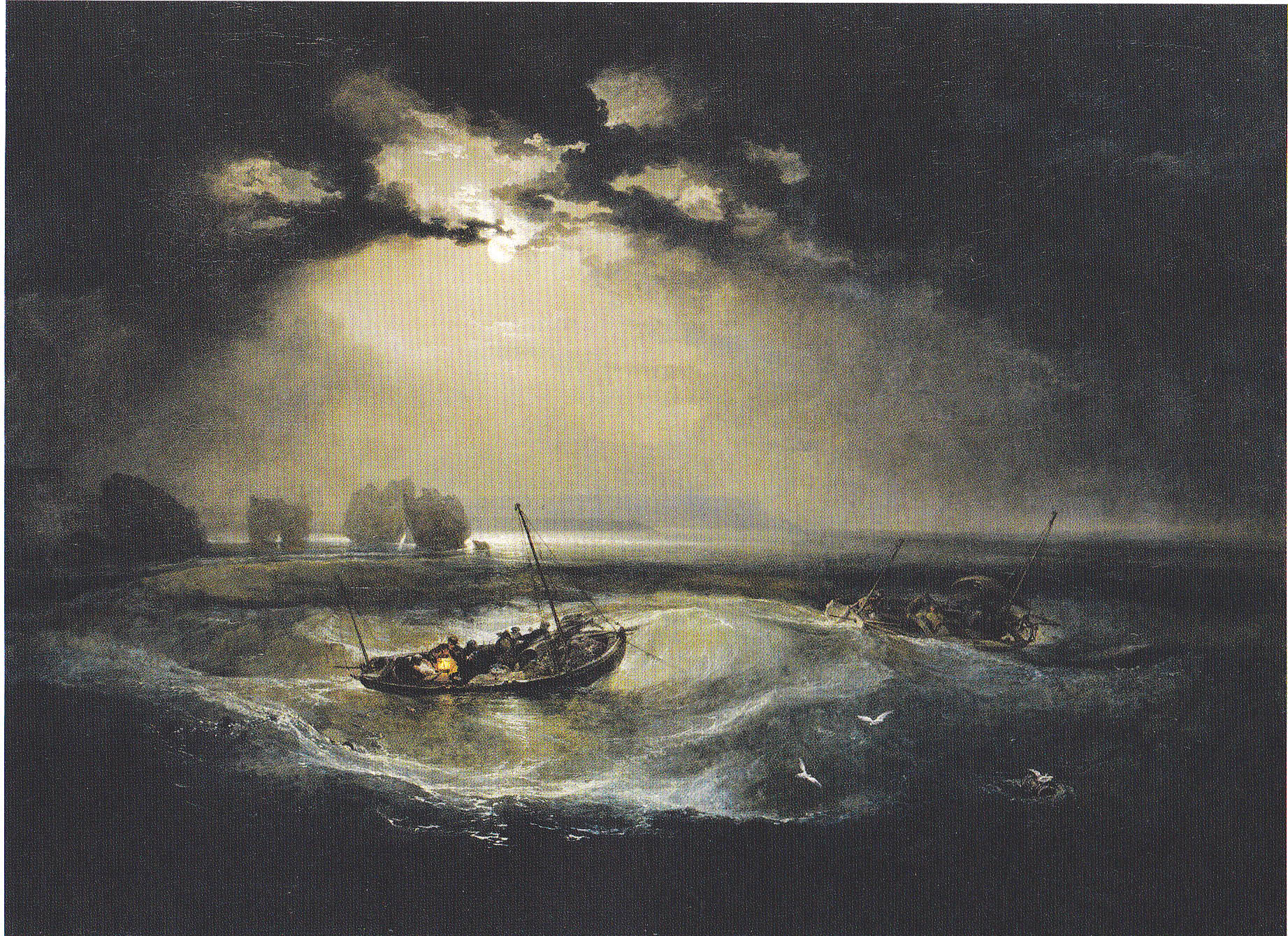
1796 Fishermen at Sea
Certainly this painting expresses the Romantic temperament; we have moonlight, swirling clouds and sea, and dramatic tonality. There is no question of the artist’s talent, yet a whiff of the self-conscious is present.
Turning to my left, I saw The Shipwreck. Nine years have passed. Turner shows the confidence of an assured and mature artist. The composition is brilliant, the narrative drama reaches a fever pitch, and the brushwork is virtuosic even by Turner’s standards. Little wonder the critics found it a tour de force.

1805 The Shipwreck
Over the ensuing years, Turner painted many subjects—natural, historical, and allegorical—often combining genres. Nearby is Hannibal Crossing the Alps in a Snow Storm. As I walk over, I move forward another seven years in Turner’s life to 1812. He began sketching the foreground figures in 1804, but a snowstorm he observed while visiting Yorkshire was his true inspiration. The painting was well received by the public, being thought ‘magnificent and sublime’, but something new is at work here. Turner is changing and this painting is suggestive of what is to come. For instance, despite the fact that he is depicting the trials of an army, the human figures are marginalized. Nature is the star player. To allow the natural phenomena to burst forth on his canvas, Turner resorts to an unconventional composition, one without any geometric order and one that throws over the traditional rules. Turner’s skill with complex compositions was the stuff of legend even then, and he taught that subject as well as perspective at the Academy. Now, as he found himself moving toward his own special vision, his old ways of thinking about painting were expanding. The battle between the idea of order and his sense of the raw power inherent in his experience of light and movement had begun. In 1817 he resigned from teaching.

1812 Hannibal Crossing the Alps in a Snow Storm
To see where his quest would take him, I walked over to one of my favorite paintings: Snow Storm—Steam-Boat off a Harbor’s Mouth. Turner painted innumerable subjects in his long career, but he was especially fascinated by the sea and its many, often times violent, moods. He returned to the sea as a subject again and again, his vision steadily evolving. The year is 1842. Turner is 67 years old and solidly in his finest period of painting. Laden with honors and financially secure, he is painting for himself, following his vision, an increasingly isolated and eccentric figure that all except his remaining friends suspect is mad. But he is no longer painting for his own time. He isn’t giving his audience what it wants; he is giving it what his eye demands he paint.
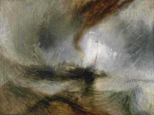
1842 Snow Storm—Steam-Boat off a Harbor’s Mouth
Obviously,Turner is not concerned with the ship; he is expressing the experience itself. Hannibal Crossing the Alps in a Snow Storm showed the tension growing in him between the presentation of what is seen and what is experienced. Here experience has won out. Indeed, the ship as a subject barely exists. The swirling, maddening power of light and snow and wind is the subject. Knowing from the title that a ship is present, one guesses that the dark line is a mast and the dark passage at the top is smoke from the engines, but these suggestions are irrelevant to experiencing the image.
What most viewers saw was simply incomprehensible. Subject matter as they understood it had disappeared.
Turner claimed he asked the captain of the steamer Ariel lash him to the mast for four hours so he could study these atmospheric effects. The story is untrue. The tale merely reflects Turner’s desire for the viewer to understand that such a moment when light, motion, and color swirl into one is real. So desirous was Turner for the viewer to understand the truth of what he had experienced, his actual title of the painting is Snow Storm—Steam-Boat off a Harbours’s Mouth making Signals in Shallow Water, and going by the Lead. The Authour was in this Storm on the Night the ‘Ariel’ left Harwich. Turner was presenting an experience to the viewer. What most viewers saw was simply incomprehensible. Subject matter as they understood it had disappeared. Turner’s painting was ridiculed as, “a mass of soapsuds and whitewash”. To understand how shocking such a picture would be at the time, one needs only to compare this painting to one by John Constable, Turner’s great contemporary, painted just five years earlier in 1837, the last year of Constable’s life.
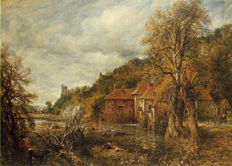
1837 Arundel Mill and Castle
A few years later subject matter as his Victorian audience would have expected has disappeared from his work as is seen in 1845’s painting, Venetian Festival. It’s a festival all right, but a festival of color harmonies floating as if on light itself.
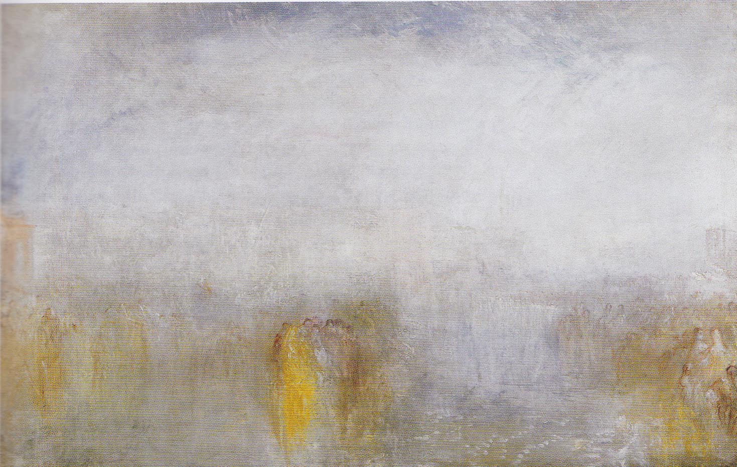
1845 Venetian Festival
Within a few years after Turner’s death in 1851, art was to take a significant change from the traditional Realism of Turner’s contemporaries. Monet and his Impressionist colleagues would soon be at work. Cezanne would be pointing the way to Cubism. Western artists would discover and be invigorated by Japanese art and then African art. The continued development of the camera would change the way artists saw their mission. Kandinsky would finally abandon any pretense to literal subject matter. Unquestionably, the intellectual and creative turmoil of the next seventy-five years is hard to overestimate. In many ways we are still working out the implications of ideas spawned during that time. Given the immensity of the intellectual and aesthetic changes that occurred, it is perhaps a fool’s errand to look for a point of origin where these momentous changes started. Indeed, contemporary painting has had many progenitors. Still, even with that said, I would urge that The Amazing Mr. Turner not be overlooked as one of the great sources of modern art.
In 1870 the France of Napoleon III engaged in an unnecessary, foolish, and unsuccessful war against Bismarck’s Prussia. It was a short sharp conflict in which the painter Bazille, friend of Monet and Renoir, was killed. Monet and Pissarro made the eminently sensible decision to relocate to London for the duration. There they were unimpressed by the dreary surroundings, painted some pictures that reflected those surroundings, and discovered Turner. Turner was not an Impressionist but he was an amazing colorist, a very daring artist, and his late work was pregnant with the future. The dramatic possibilities he poured forth were not lost on the two great French artists. I find it hard to look at Monet’s magnificent ‘Waterlilies’ series and not think of Turner.
And I’ll go even further out on the limb. If Cezanne is generally accepted as the spiritual father of the Cubists and the other ‘structural’ movements in modern art, perhaps it wouldn’t be entirely amiss to say that Turner was the spiritual father of the ‘action’ and ‘colorist’ schools that would follow. Looking at the swirling intense colors of his canvases, where color and movement and form and subject melt to become one, it is possible to see the beginnings of abstract expressionism and such artists as Pollock, Twombly, Mitchell, and Frankenthaler among many others. And in Turner’s free fusing of the subject in a swirl of emotion and movement, can the vision of De Kooning be so far away? But enough. It’s easy to say too much and influences are indirect and much mutated as they filter through time and the talents of others.
Perhaps it is best for us to return to that October day at the Tate Britain. It’s a curious thing, but there is a place where one can stand and see The Fishermen and Snow Storm—Steam-Boat off Harbor’s Mouth at very nearly the same time, just by slightly shifting one’s eyes between them. The effect is startling, almost disorienting. What a very great way Turner traveled and what an amazing new world he found.
Or in the words of Jerry Garcia, “…what a long strange trip it’s been.”
Return to Artists and Their Art
Copyright 2013 James Tucker
Comments Off on The Amazing Mr. Turner
Filed under Creative Process, Gallery Experiences, Notes on Art History