(Usually I do the interviews for Jackson Point Art, however interviewing oneself is rather awkward. I would like to thank Deborah Tucker for doing this one. )
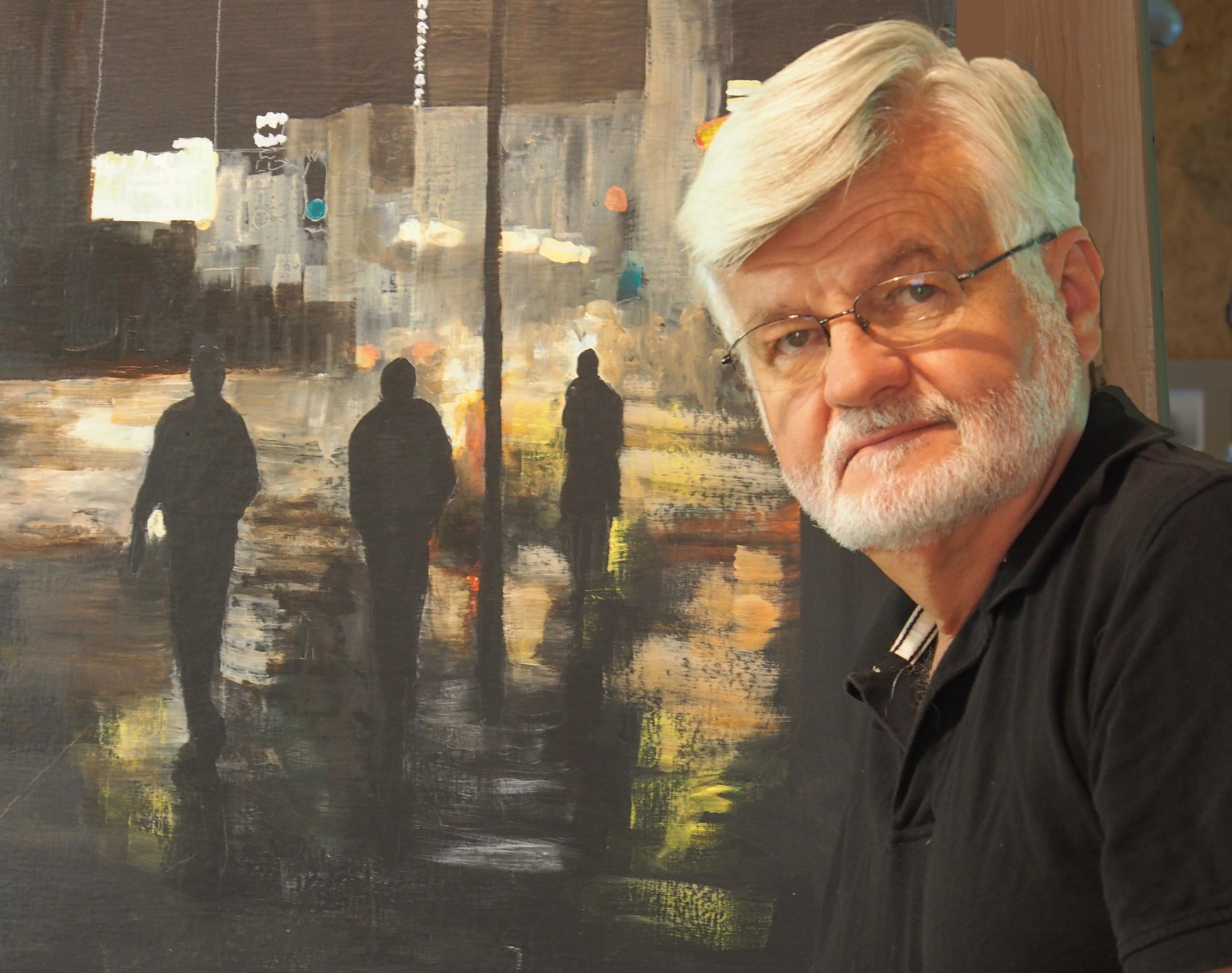
James Tucker was born in Connecticut and lived there until his family moved to Clemson, South Carolina when he was 10 years old. A graduate of the University of Georgia, he worked in Atlanta before he and his wife moved to the Cumberland Plateau near South Pittsburg, Tennessee. He has shown his work at a number of galleries and art shows over the years, most recently at City Hall in Chattanooga.
See more of James’s art at: James Tucker
For interviews with other painters see: Ellyn Bivin / Josiah Golson / David Jones / James McKissic / Renel Plouffe / Larry Young
You’ve been involved with art for a long time now, haven’t you?
Yes I have. I started art school at the University of Georgia in 1965 and took all the foundation courses toward my art degree and did some of the studio work with David Paul and Mike Torlen before switching my major to History at the end of my junior year. Later I took studio classes at the Atlanta College of Art and at Callanwolde Arts Center. Two of the teachers at Callanwolde, Amelia James and Karen Stinnett, were very helpful in my development as an artist.
You come from an artistic background. I believe your grandmother was an artist and knew some of the American impressionist painters of the Old Lyme School. Did she encourage you as an artist?
I think the artists she knew were active in Old Lyme during the 1920s and 30s. I suppose you would call it the ‘second flowering’ of the Old Lyme School. Her name was Helen B. Tucker, and she was born in Providence, Rhode Island, but moved to the Old Lyme, Connecticut area after her marriage. She was a small but formidable woman, and she gave me my first set of oil paints when I was eleven or twelve years old. She also gave the very occasional piece of advice. I’d been painting in watercolor, taking lessons from Olivia McGhee, a local artist in Clemson, South Carolina, and was getting discouraged with my work. Gram said not to judge what I could do in watercolor until I’d painted at least 100 pictures! I don’t know how serious she was, but I kept working and shortly thereafter produced the first painting that my family framed: a picture of the Mayflower at sea. My youngest daughter, Molly, has it at her home in England. It was the “Magnum Opus” of my early period. [Laughs] Another time when we were visiting her, Gram took me out sketching. I was proud of what I’d done until we showed each other our work for the day. She was sweet about it, but the difference between what we’d done was obvious and painful to me.
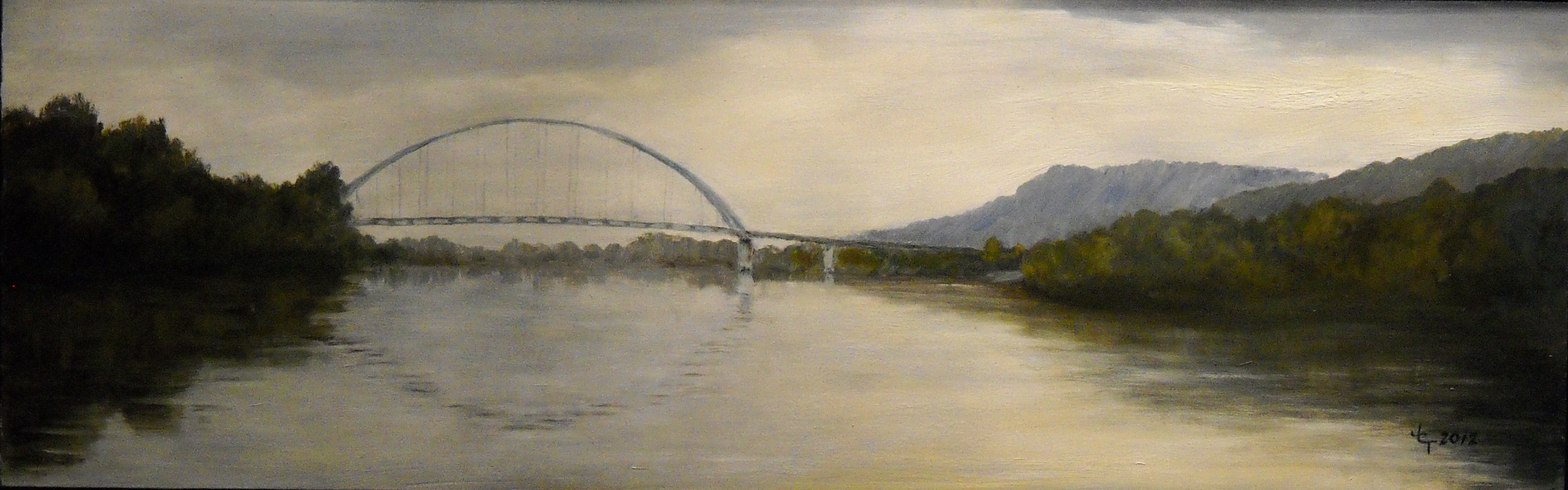
James Tucker– Unsettled Day–Shelby Rhinehart Bridge, South Pittsburg 14×36 Oil on panel
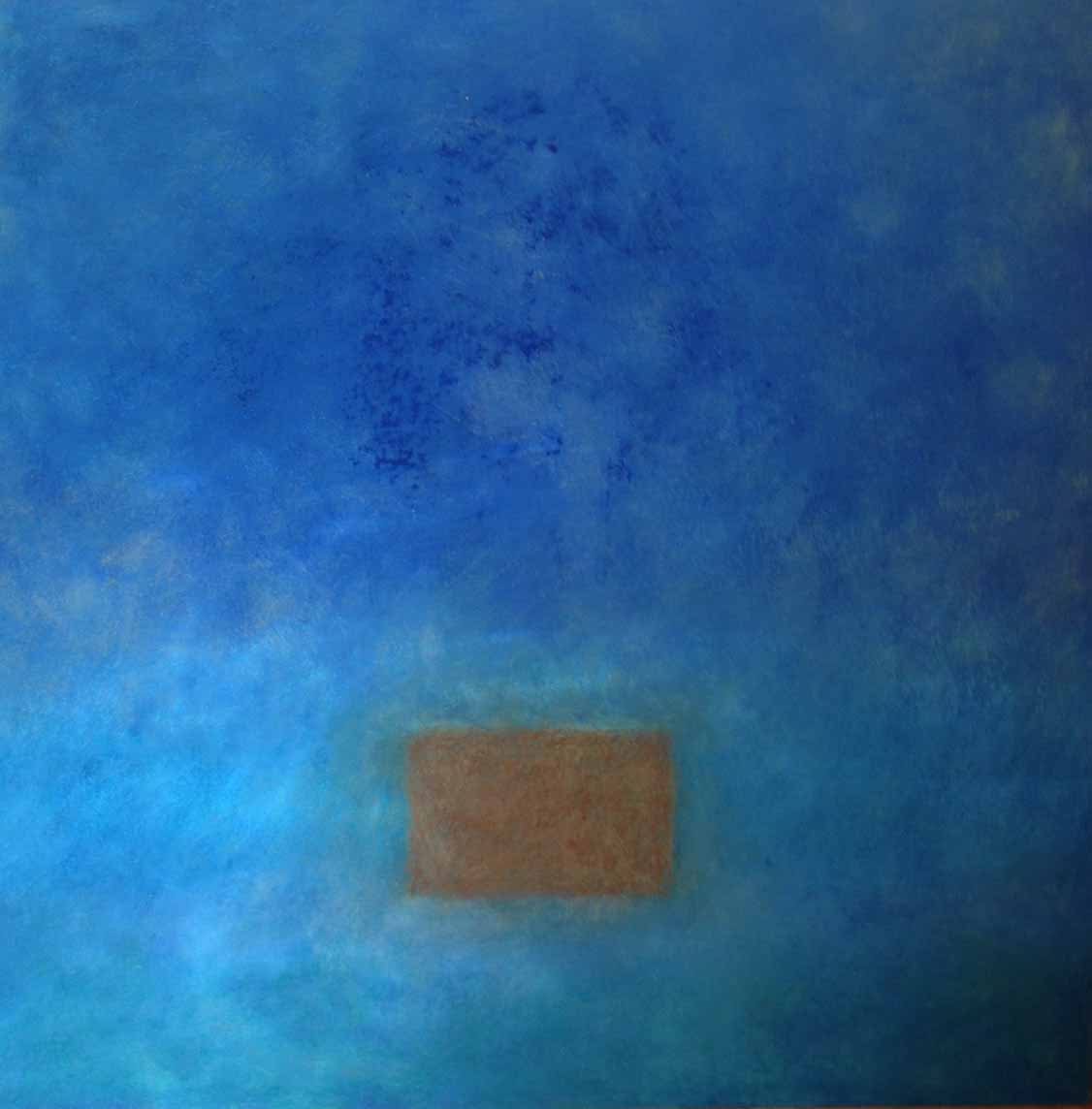
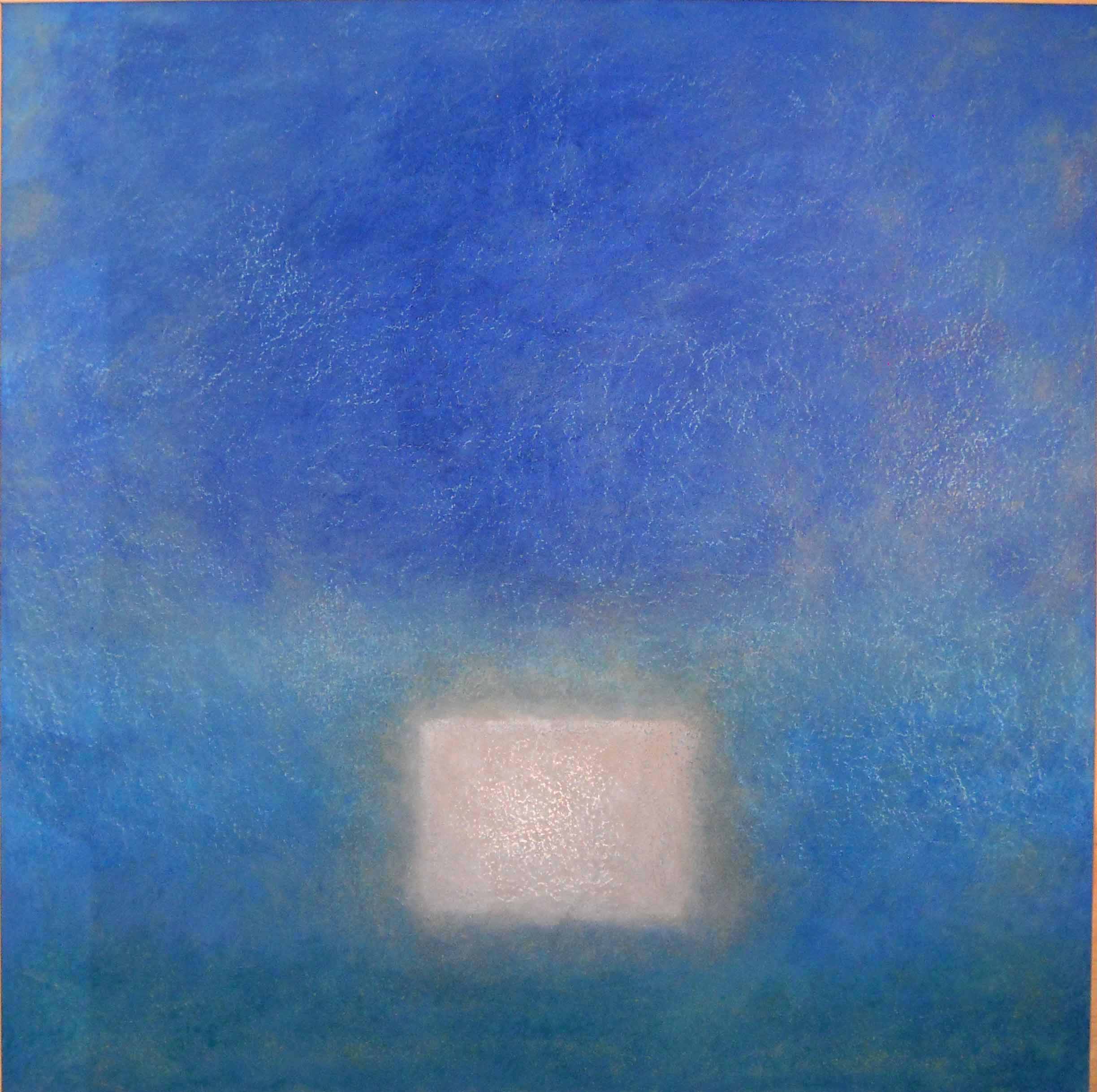
In the last few years your paintings have shifted from quiet, almost meditational, landscapes done along the Tennessee River to your current focus on the human figure. Would you talk a bit about that transition? What brought about the change?
That’s a good question, and it requires that I go back in time a little. For many years I was a landscape painter working mainly in watercolor. In the 1980s my work was represented by several galleries in the Atlanta area and in Greenville, South Carolina. My life got very busy working for The Atlanta Journal-Constitution during the 1990s, and I continued working with watercolor or pen & ink because they don’t take much space and are easy to set up. When we moved to Tennessee, I built a small sailboat with my stepson, Andrew, and began painting what I saw on the river. It was then I switched to working in oil, because I had the time and the studio space. I was seeking to create a dreamy, timeless quality in what I called my ‘riverscapes’, which is how I usually feel when out sailing. David Jones approached me at that time about showing in his new gallery, Graffiti. I turned him down several times, thinking my style wouldn’t fit in, but he persisted, and I finally said yes.
And did you fit in?
No, not at all. There were abstract expressionists, geometric constructionists, and color field painters like David…and me. I should have withdrawn after the first show.
But you didn’t.
No. I like David and respected his vision for the gallery, plus I’d become intrigued with the work some of the other artists were doing and decided to give it a try. For a little over a year I painted non-representational work that was totally different from anything I’d done since art school. I also switched from oil to acrylic to take advantage of acrylic’s faster drying time, as well as all the mediums and foundation materials that are available.
-
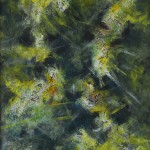
- James Tucker– Impromptu in Green 24×20 Acrylic on panel
-
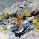
- “Whitewater” 10×24 Oil on paper– Private collection
-

- James Tucker– Quarry (2) 16×20 Acrylic on illustration board– Private Collection
How did that go?
It was tough. That garbage you hear people say about how their five year old daughter can paint better than a famous abstract artist is just that—garbage. I made a few interesting paintings and painted over a lot of failures. I’m pleased with the best of my work from that time, but I never felt comfortable in a non-representational idiom. Where in the past I’d been communicating with symbols I shared with the viewer—trees, water, sky, clouds—I now found myself attempting to make a statement without those things. It was very difficult, and I couldn’t sustain that approach. But the year wasn’t wasted. When I came back to a more representational style of painting, this time working with the human figure, I brought along a lot of what I’d learned and experimented with. I now paint my figures with far less detail than in the past, concentrating instead on the expressive qualities of the human form as a semi-abstract shape. It’s very gratifying to me that those paintings have been well received.
Where do you get your ideas for paintings, considering how your work has undergone some significant changes?
I suppose the differences in my style arise from contradictions in my personality. On the one hand, I can be very introverted and have no problem being alone in the studio all day, day after day, talking only with my wife in the evening. I think that’s the quiet place the urge to paint landscapes comes from. On the other hand, people really fascinate me. I never tire of watching them move about, interact with each other, and see how their little ‘mini-stories’ unfold. I wish there were a sidewalk café where I could sit and watch them every afternoon. Obviously, that interest forms a direct link to the figurative work. Yet, like the landscapes, there is a lower-keyed, quiet aspect to my figure work, too. I rather view the human experience as something that’s difficult and fundamentally lonely. People struggle, often with great courage, to find meaning and order in their experiences and relationships. Many of my figurative painting are an attempt to express that.
-

- Adieu 14×11 Acrylic on panel
-

- “Queue” 14×11 Acrylic on panel
In paintings like Adieu and Wayfarer (2) you present people in a state of reflection, but the context is enigmatic.
Yes, that’s intentional. I want to provide some context, but not offer defining information about the people I paint or draw. What I would like is for viewers to enter into the being of the figure, bringing with them a state of mind that is real to such viewers and not dictated by me. If you make things too specific, the piece slips into illustration, because greater specificity of the image limits the range of responses from the viewer. I want viewers to embrace the story as it exists within them, in whatever way my work suggests to their minds and emotions. It’s very pleasing to me when people ascribe very differing ideas to what they see. There’s no right reaction or, rather, every reaction is the right one. The essential meaning of any painting arises between the painting and the viewer. I want viewers to look at my figures and tell their own stories, not mine.
If you have such a firm idea of the story, even if you conceal it, to what degree are these seemingly anonymous figures either portraits or self-portraits?
I suppose they’re all self-portraits—the men, the women, everybody. I’m painting my thoughts and moods, my feelings and ideas. I would never do it, but I could walk up to someone viewing one of my paintings and tell that person exactly what the figure in the painting is thinking and feeling. I know all the backstories, but, of course, they are my backstories. I did a painting I called “The Last Table” and was delighted when people formed all sorts of ideas about what was going on with the three figures. I know what I was thinking when I painted it, but any viewer’s story is as ‘right’ as mine, as least for them.
James Tucker– The Last Table 40×30 Acrylic on panel (Private collection)
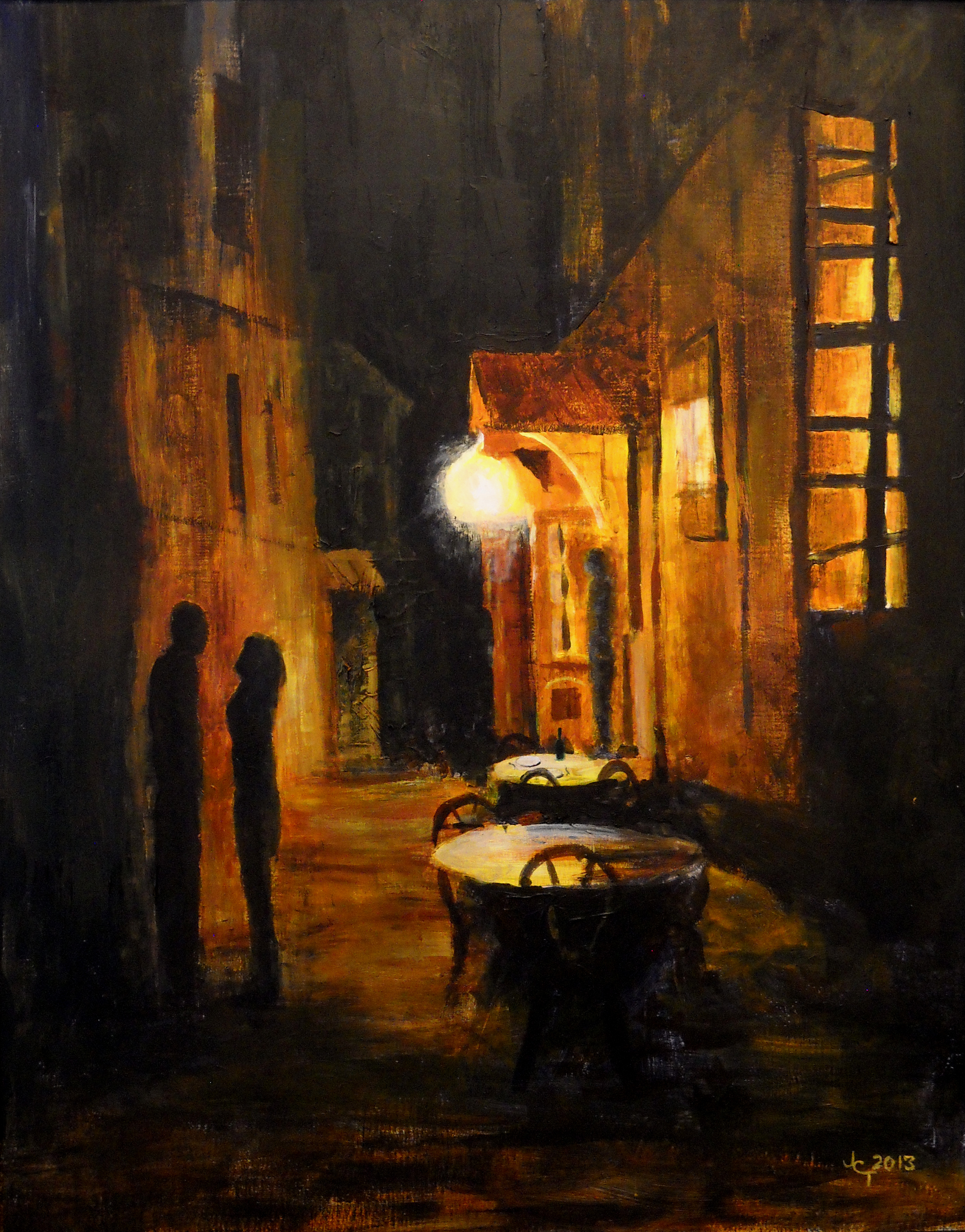
You live up on the Cumberland Plateau and paint in a book-lined, rustic studio. It’s not what one would expect from someone painting night scenes of people in the city.
No, my world isn’t a downtown loft sort of place, but I’m fascinated with cities. My wife and I have spent many days just rambling about in cities in the US and Europe, with no plan or goal. I find them endlessly fascinating, and at night the shapes become more abstract and the sense of mystery and possibility grows.
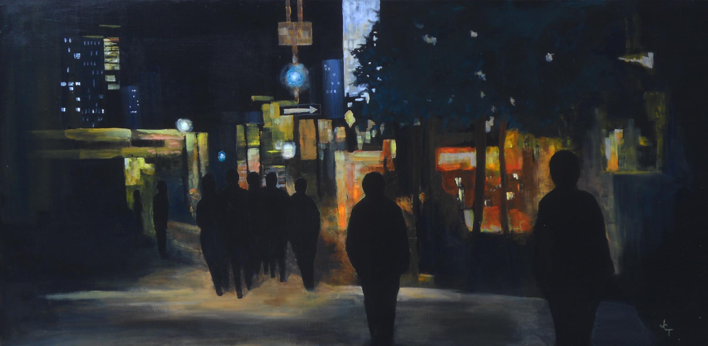
James Tucker– The End of the Evening 24×48 Acrylic on panel
You’ve described how you painted your landscapes. What is your process when making a painting today?

“Scene de Vie (1)” 9.75×7.25 Watercolor– Collection: Hannah Fowler
My methods now are somewhat similar to how I’ve worked in the past. I will observe something around me or see some visual motif in a photo. If it’s something I see, and I’ll make a note and a quick sketch of it. If it’s a photo, I’ll file it away. I check through my files and notes regularly, and at some point I’ll find an idea I want to carry forward. Then I start making thumbnail sketches, just playing around with visual ideas. Sometimes I do a preliminary gouache but often just work up the painting from the sketches. If I paint the gouache, I edit that and work on the final painting using the study painting and its notes as my reference. There have been times, however, when I decide that the study painting says everything I have to say and I just stop there. “Scene de Vie (1)” is an example.
The tonal range in many of your paintings is striking, but your palette is usually based on cool hues and is subdued. Is that a conscious choice or an unconscious aspect of your style?
I’m very drawn to the tonalities in black & white, whether it’s ink drawing, old movies, or 1950s TV. I did a lot of pen & Ink and ink wash drawing early on. I love the dramatic tonal juxtapositions you can get with the pen and the subtle shades of gray available with ink wash. No one would call me a great colorist. I know enough about color and color theory to use it the way I want, but I find tonality, not color, is central to most of my work. Every now and then I’ll paint something using rich color, but cooler bluish tones, blacks, and grays are what attract me. When making a painting, my goal is to get the underlying abstract structure of the painting correct and tonally balanced. If I get that right, I usually have what I’m after.

James Tucker– Wayfarer (2) 15×22 Pen & Ink with watercolor wash
Several of your new paintings have a very rough surface. What’s going on there?
When I was painting nonrepresentationally, I experimented with different surfaces, and one I used was made by mixing sawdust into gesso primer. That was the surface used for a painting called “Threads of Time”. It is very rough and irregular and forces me to keep my painting loose and free, since detail is impossible. It also provides an interesting way to layer colors. You can paint on a base color and then carefully bring a brush back over the area with a much lighter or darker color, just touching the very top of the textured surface.
You used that surface in your “Wanderers” paintings. Would you talk a bit about those?
Those paintings originally began to form in my mind due to all the images I was seeing of the refugee crises happening around the world. There are seemingly endless armed conflicts forcing people from their homes. They become rootless, wandering, going from something but not to anything. I find that very troubling and compelling. As I thought about it, I began to consider the process of wandering in much broader terms. I began to wonder if we are all wanderers to a greater or lesser degree. We’re born into this world where there is no instruction manual, no roadmap for existence. You spend your life trying to figure out how to live your life. I think we all, if we are honest with ourselves, go through life making the best go of it we can, but not really knowing what’s over the next hill or what we are supposed to do about it. Of course, political refugees have all that to contend with AND they’ve had their way of life destroyed by madmen.
-

- James Tucker The Wanderers (1) 16×36 Acrylic on prepared panel — Private Collection
-

- The Wanderers (2) 32×24 Acrylic on prepared panel
You’re a writer as well as a visual artist. Does that influence your work?
Yes. I love stories and I process life in terms of story. It’s central to my worldview and how I get a sense of psychic order. That was what was so tough for me doing abstract painting—there’s no story! I felt caught in the endless process of applying paint. In my current work I want to avoid a sense of literalness, but all my painting is about story. My writing about art and my interviews with artists also helps broaden my thinking about my own work. I find that my writing about others provides an important source of new ideas me.
What artists, and I suppose I should add writers, influenced you the most?
I love the pen drawings of Rembrandt and Goya. Using just a quill pen, they could do so much with so little—a few squiggly lines come alive as a person. I’ve also studied the great late 19th and early 20th century pen & ink illustrators like Coll, Gibson, Flagg, and so on. They were geniuses at spotting lights and darks and creating structure. I’m also very attracted to the work of Whistler, with his sense of design and delicate touch. As for writers, I’d have to say Albert Camus and Joseph Conrad. Reading Camus early on had much to do with how I see life, and Conrad is just endlessly deep. If I could paint the way Conrad writes, I would die a happy man.
For a long time artist, you’ve gone through some surprising transformations. What lies ahead?
I have no idea. I’ll just engage with ideas and images that motivate me and let the brush take me where it will.
Return to Interviews with Artists